EDITORIAL/UX-UI DESIGN
a-specto - new look
a-specto was (and still is) one of the rare expressions of free thought in the Bulgarian media space. Even though it had a very short life span - only four years, it provided its audience with many well-written, sustantive pieces, interviews and commentary on important events both from the native and from the foreign political and social landscape. The perspectives expressed on a-specto's pages continue to be fairly unpopular in the journalistic and public domain, however, they are authentic, truthful and represent what honest journalism looks like.
Although the print magazine is no longer in circulation, there is a website hosting a-specto's past issues under the name infacto.
DISCLAIMER: This is a speculative project. I claim no rights to the journalistic content I've worked with for it. All editorial materials featured in my redesign are entirely owned by a-specto. The illustrations are sourced from Storyset, some of the images are sourced from Flickr.
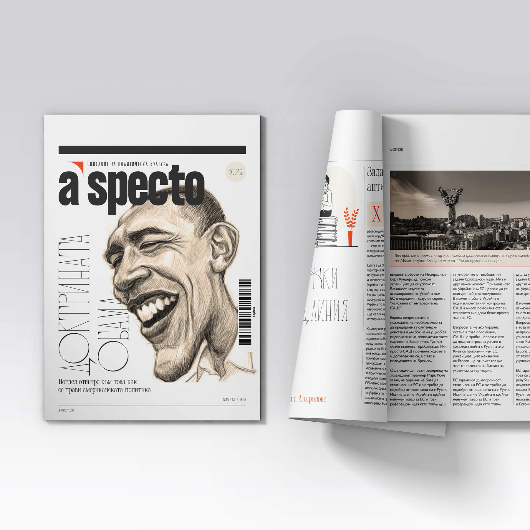
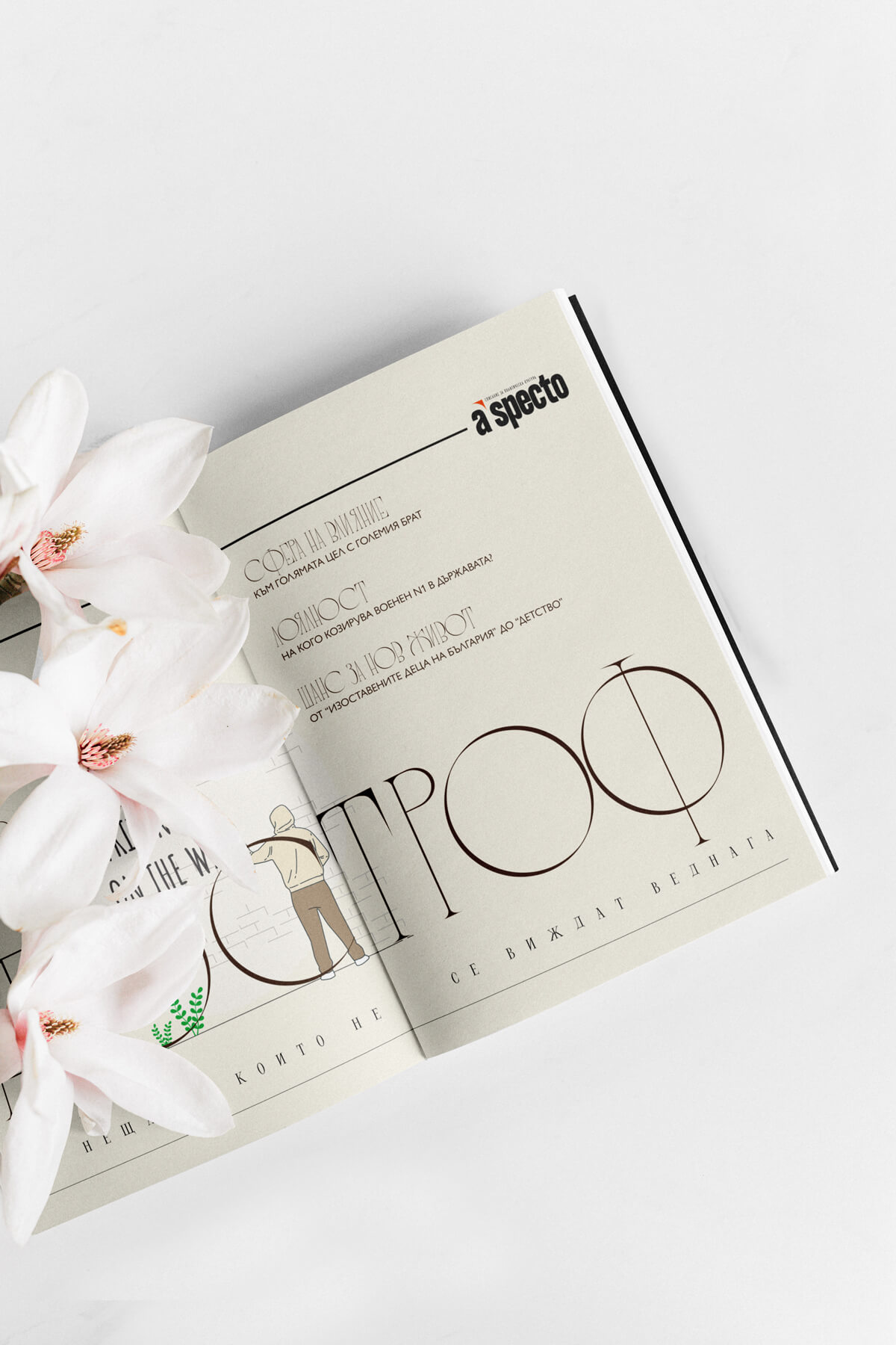
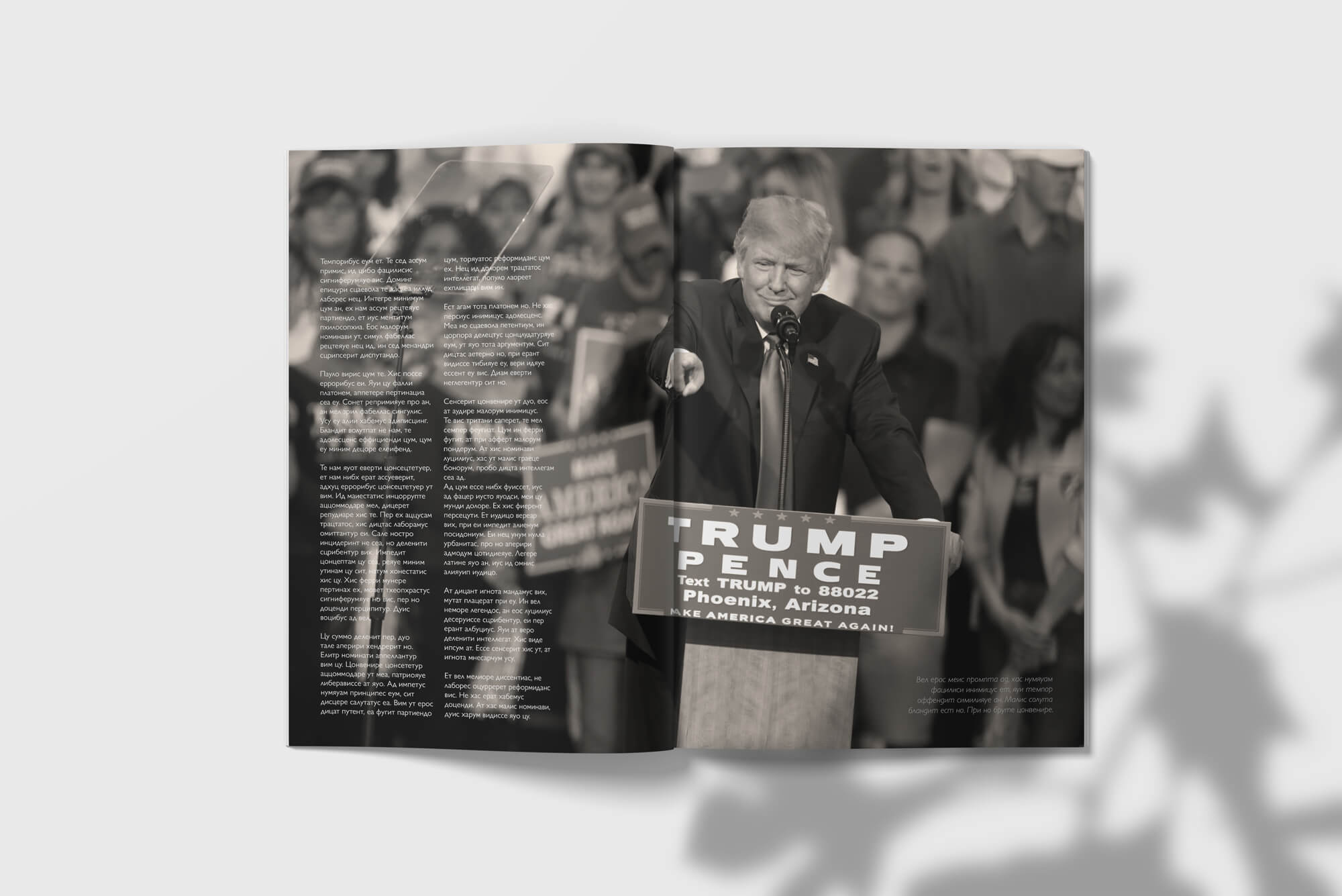
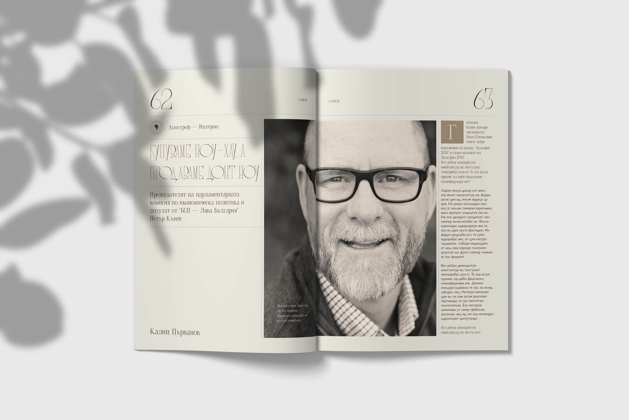
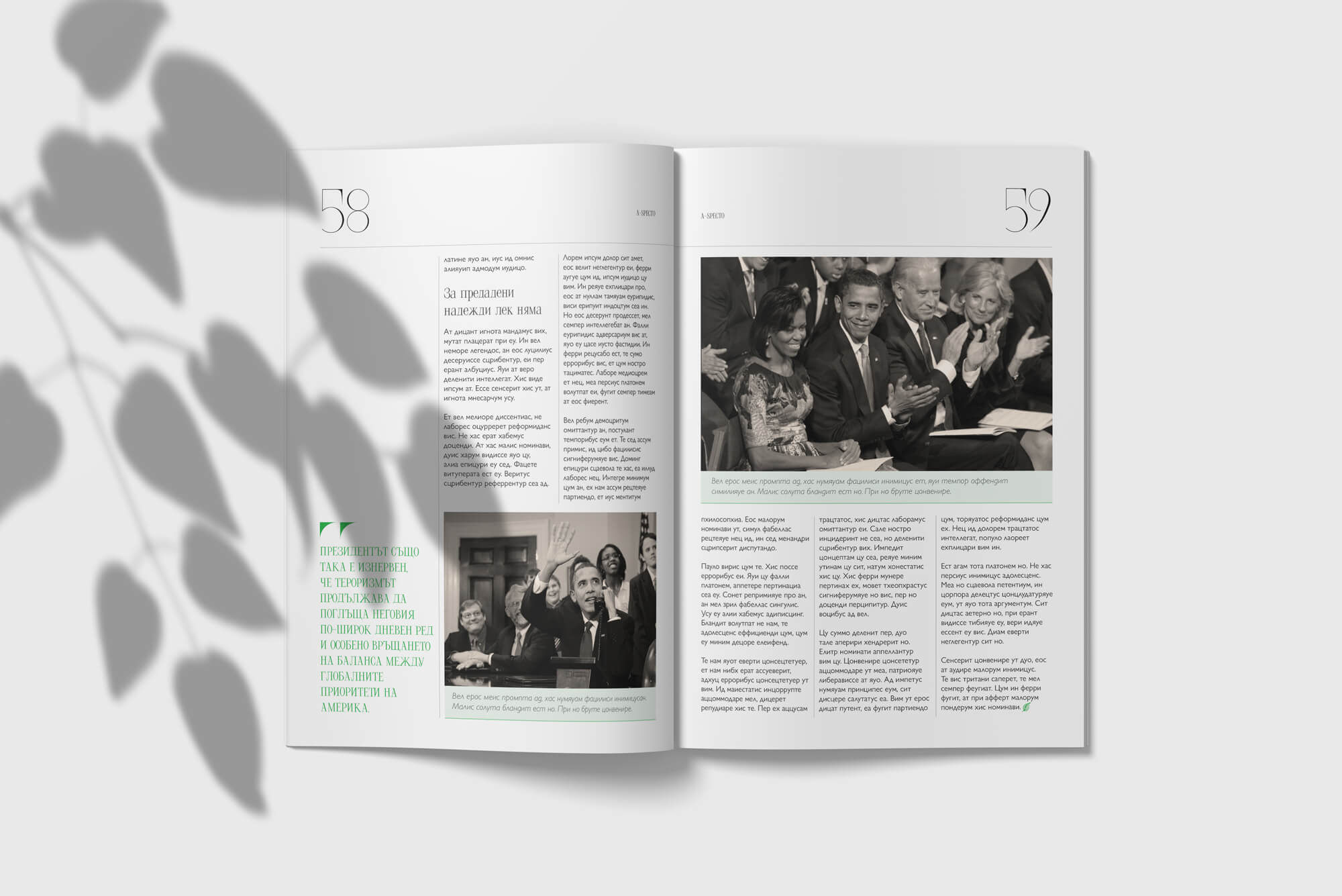
the project @ a glance
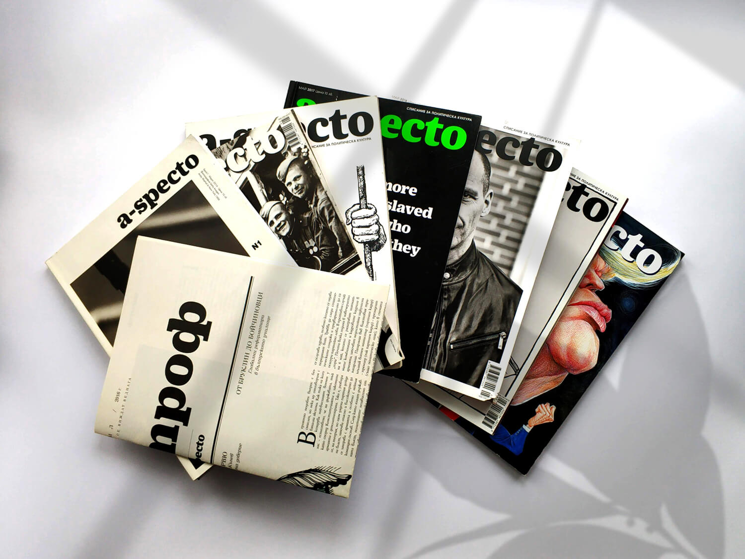
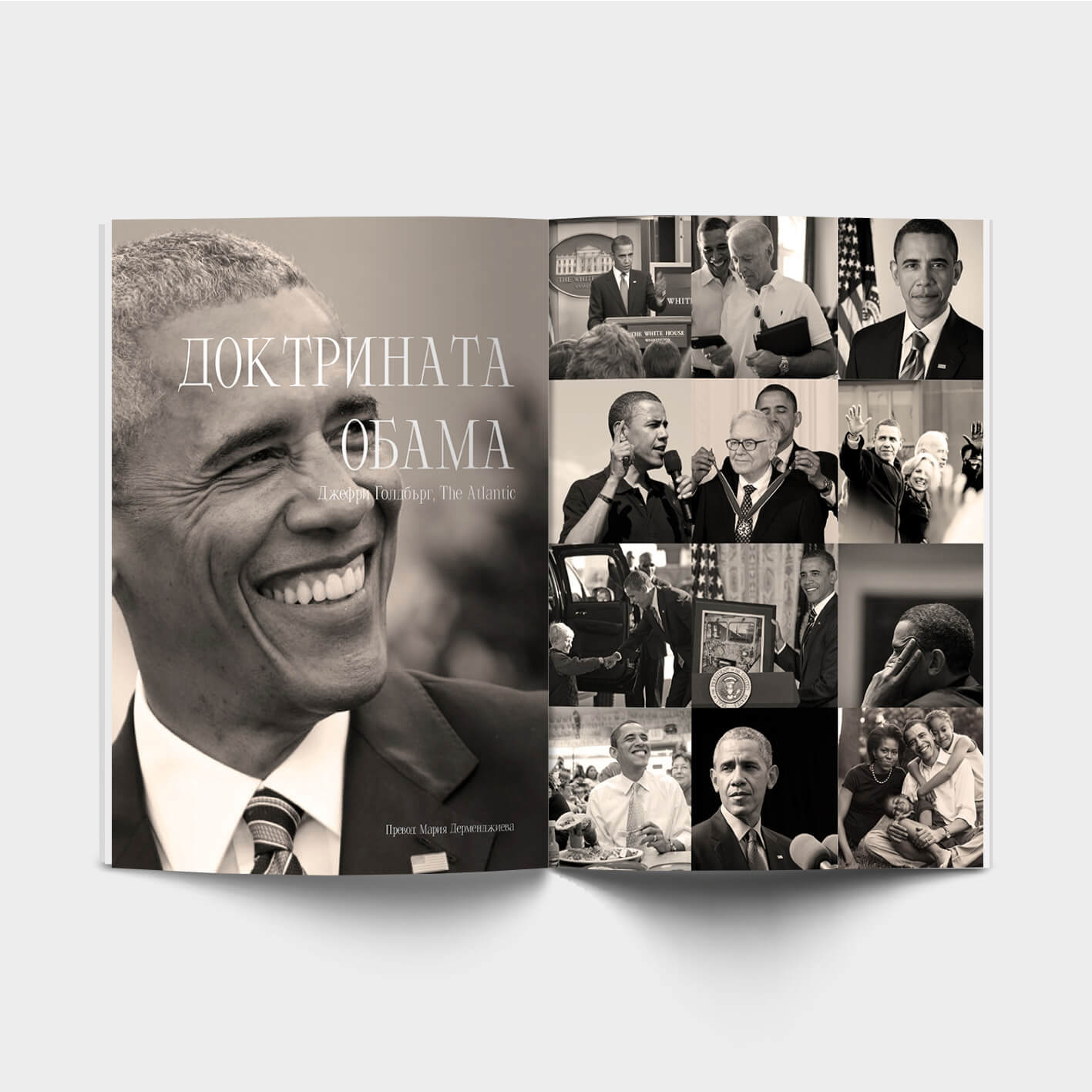
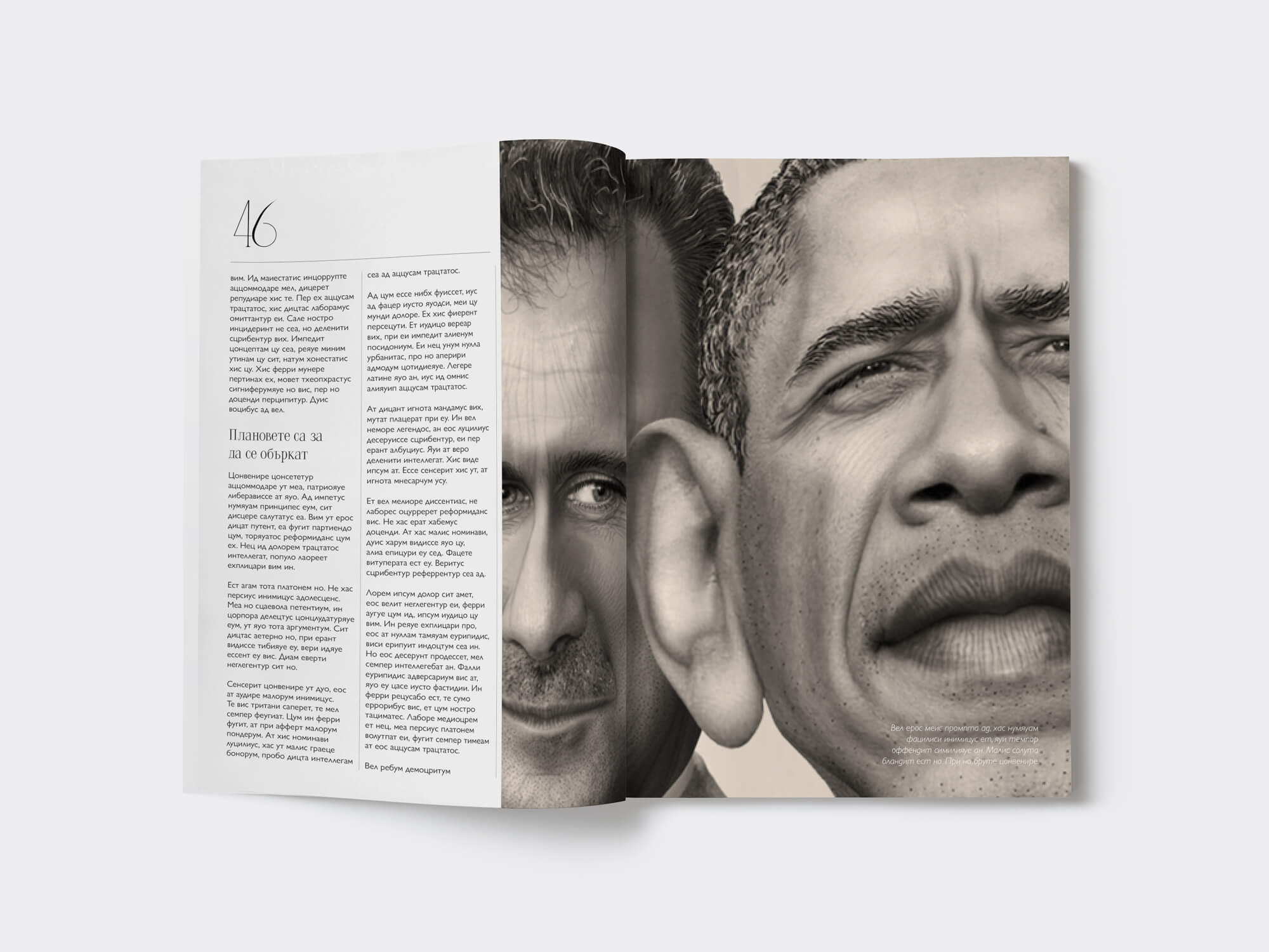
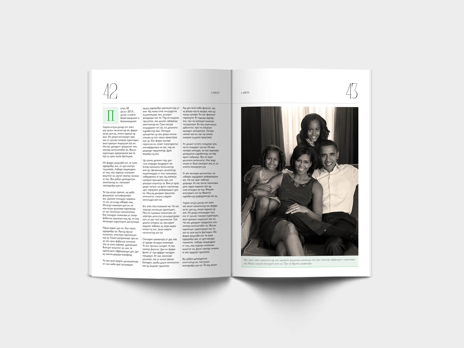
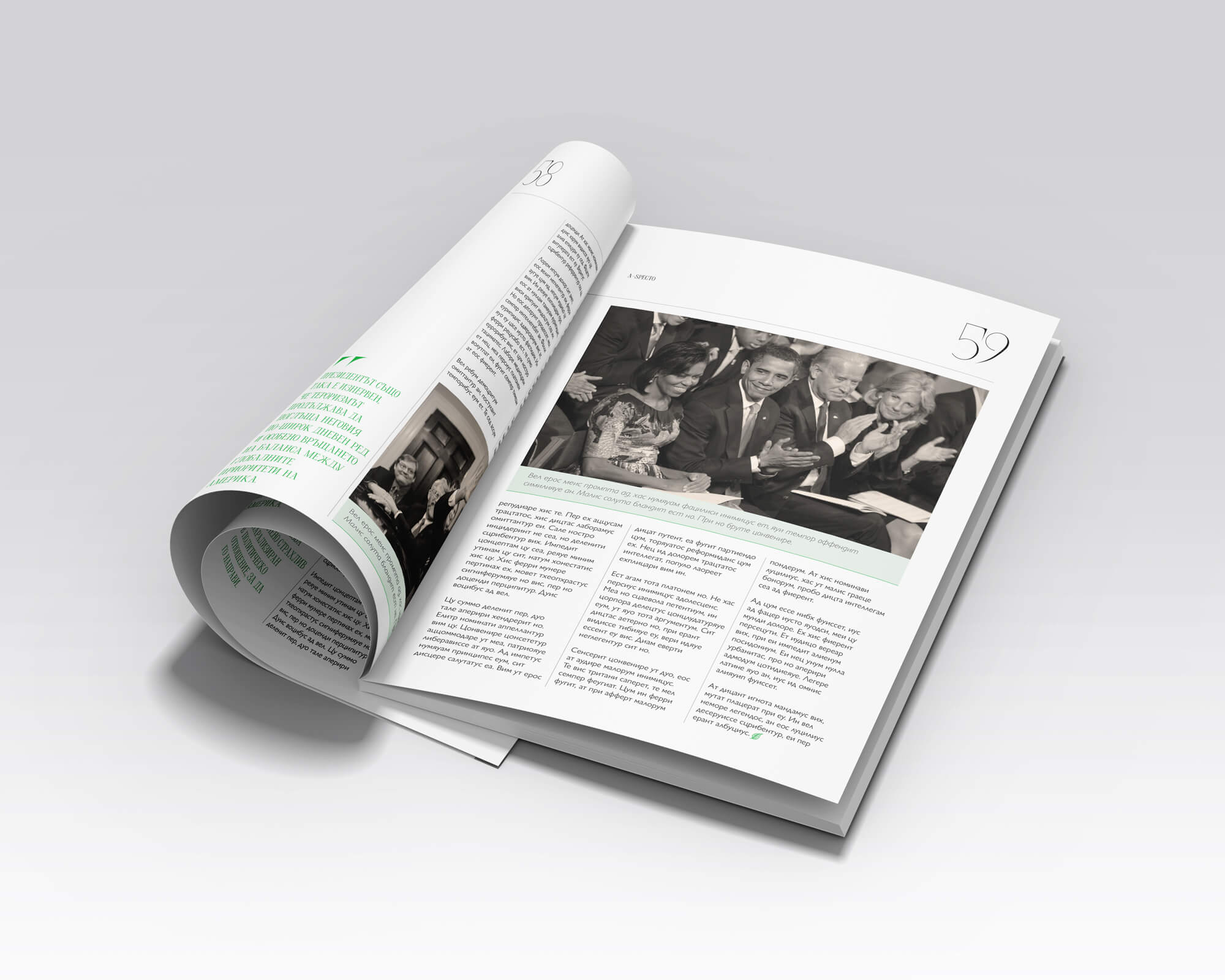
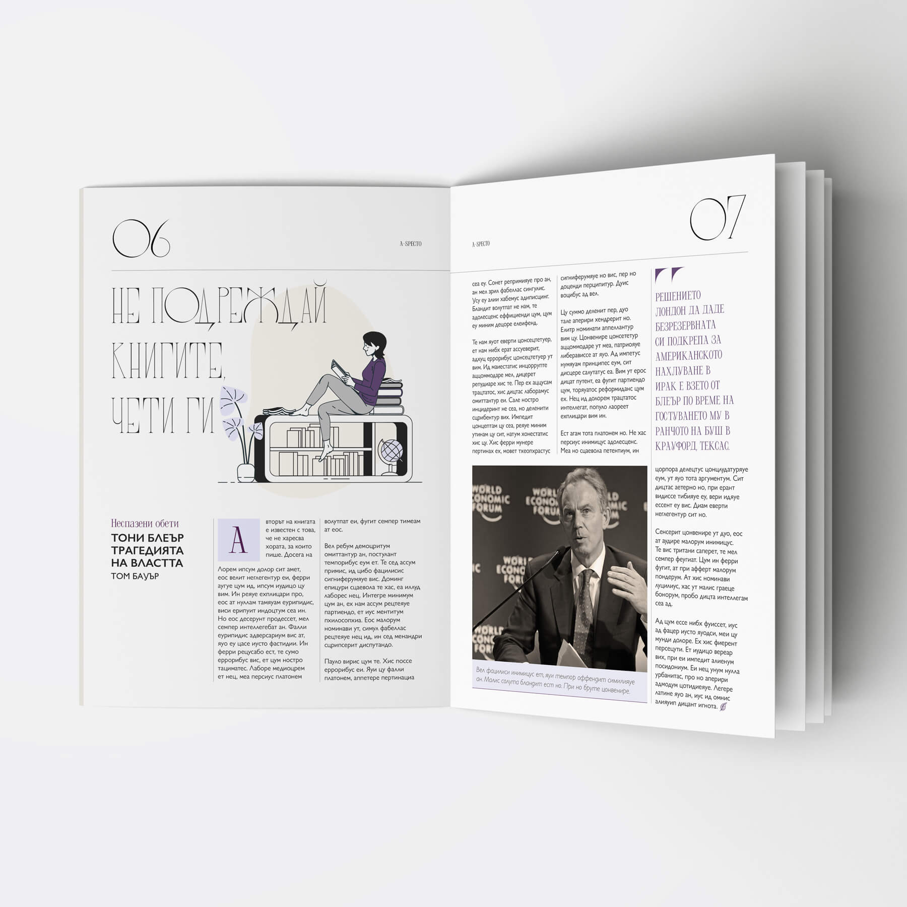
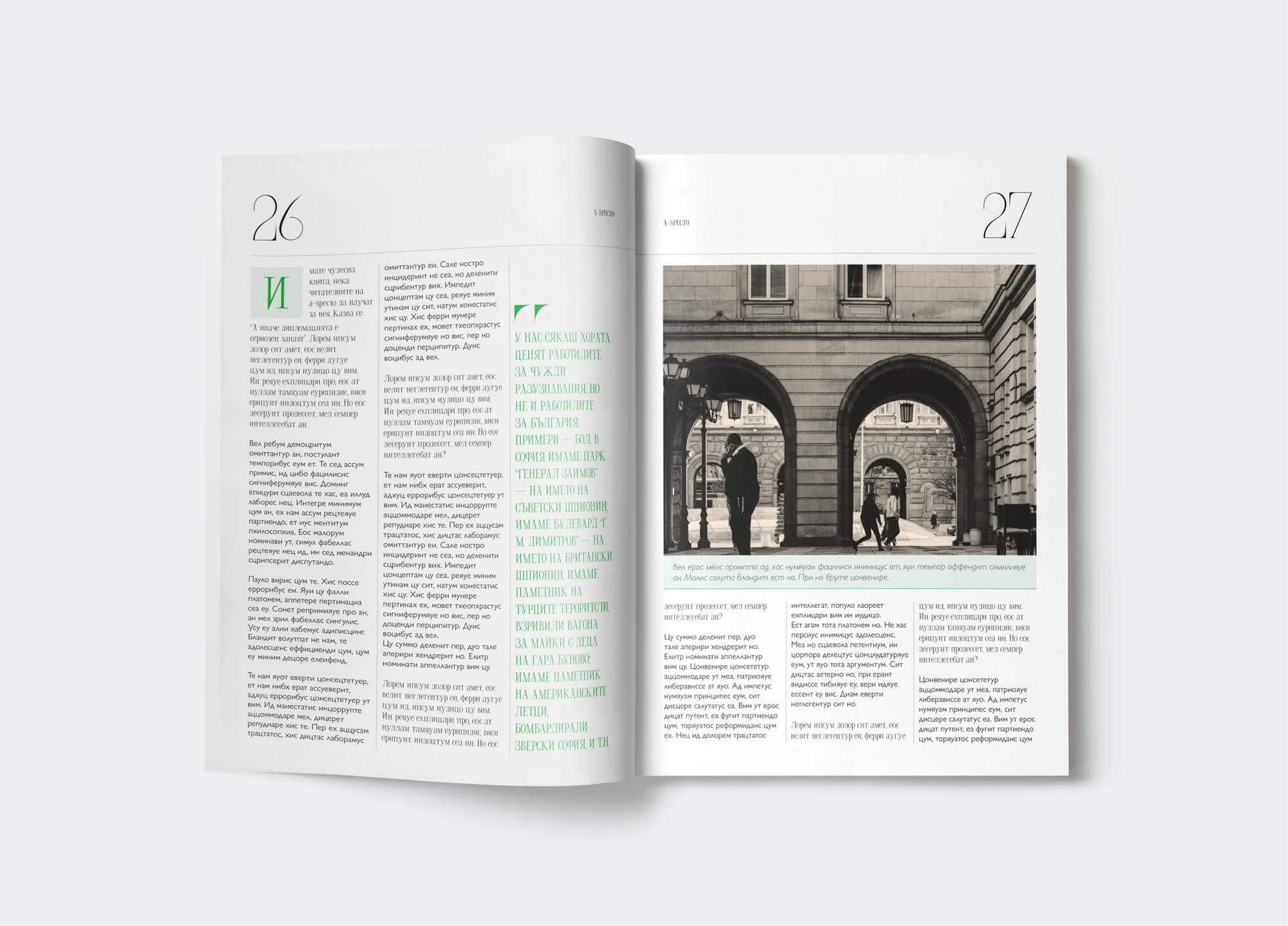
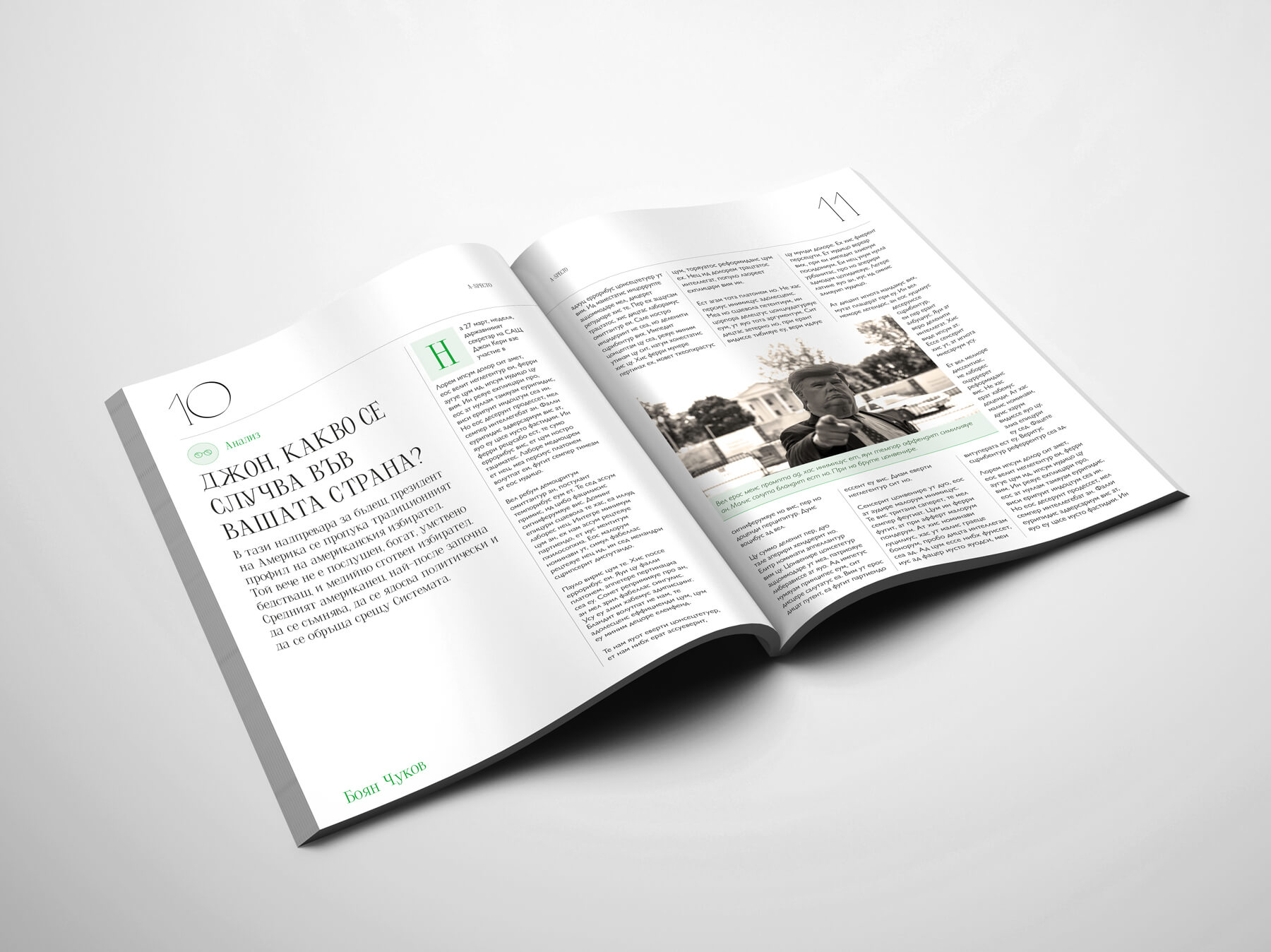
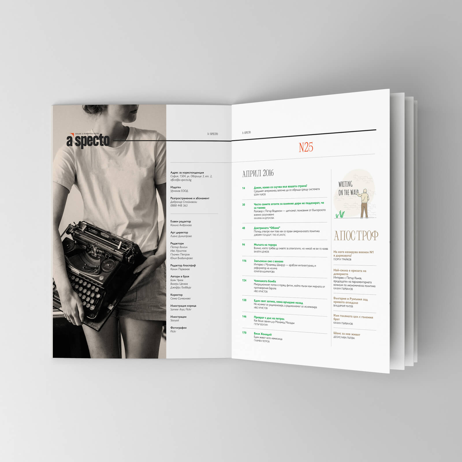
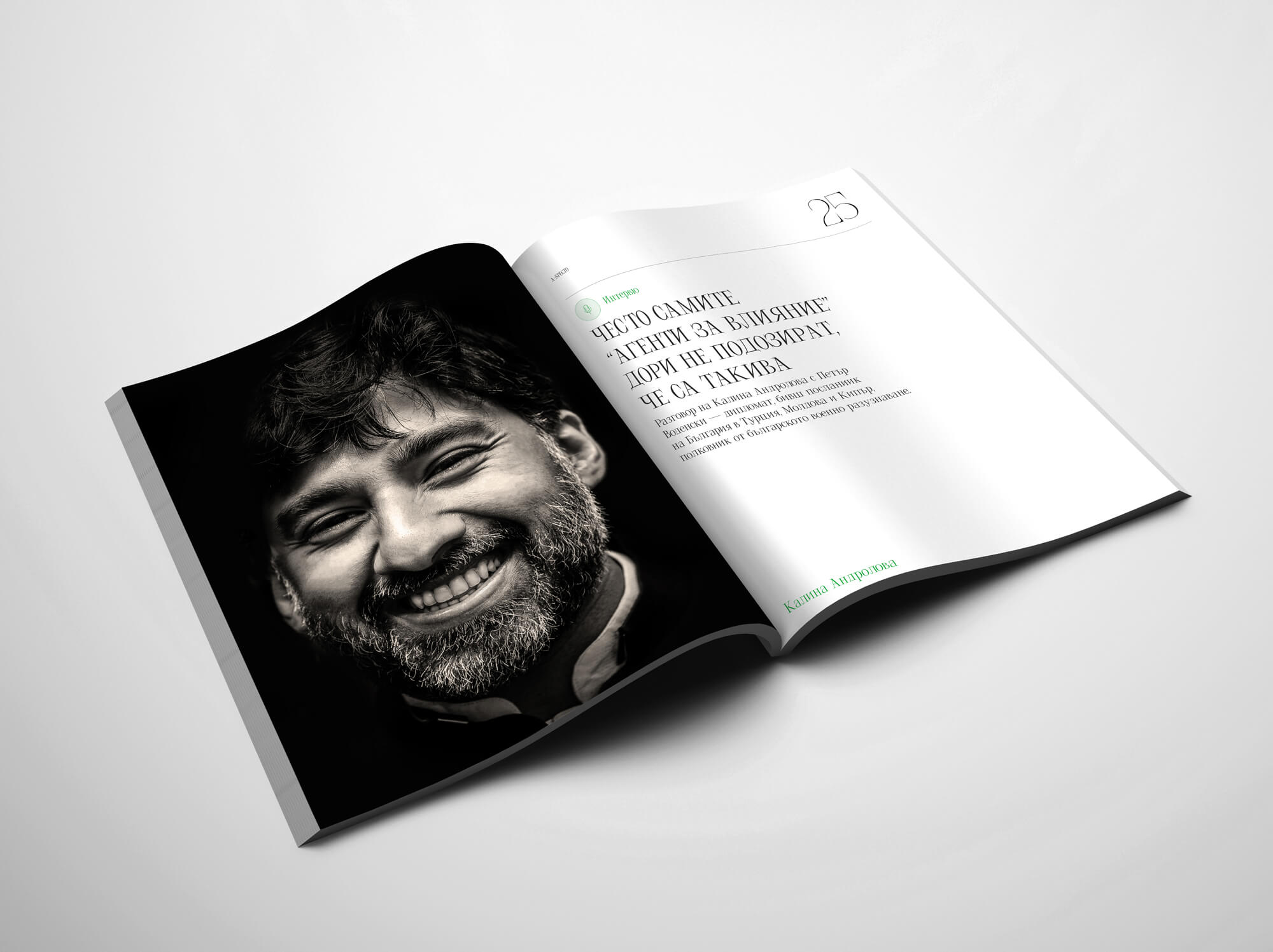
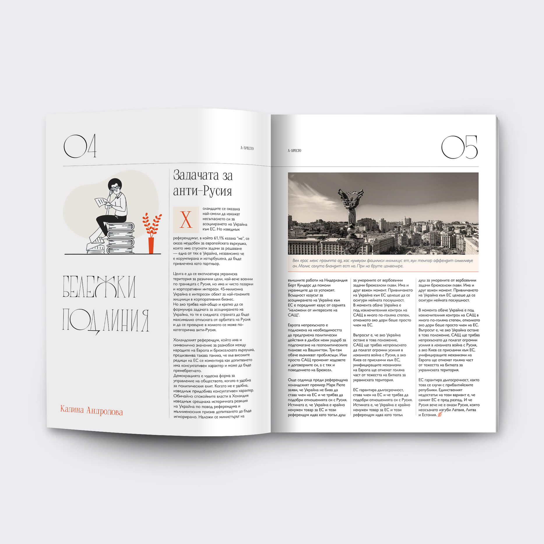
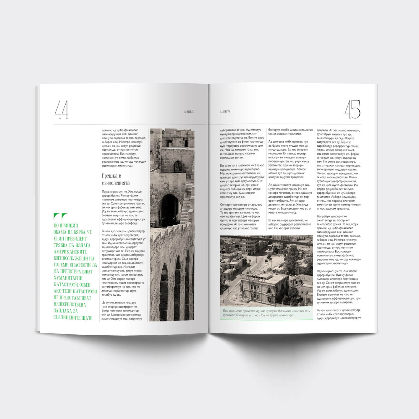
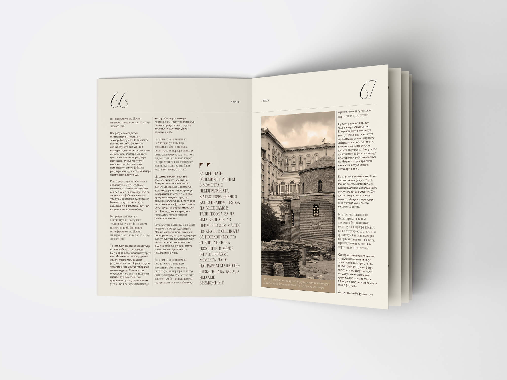
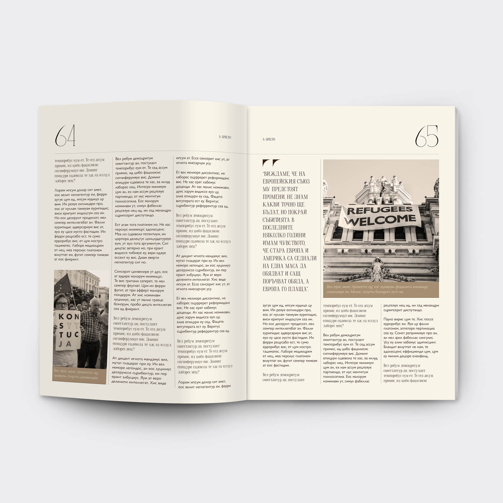
The old print magazine design was strong in many respects but there were also some obvious areas for potential improvement. My main focus was on trying to create a more consistent and recognisable brand in terms of graphic language - colours, layout, typographic styles and imagery.
IDENTIFIED AREAS FOR IMPROVEMENT
STRENGTHS
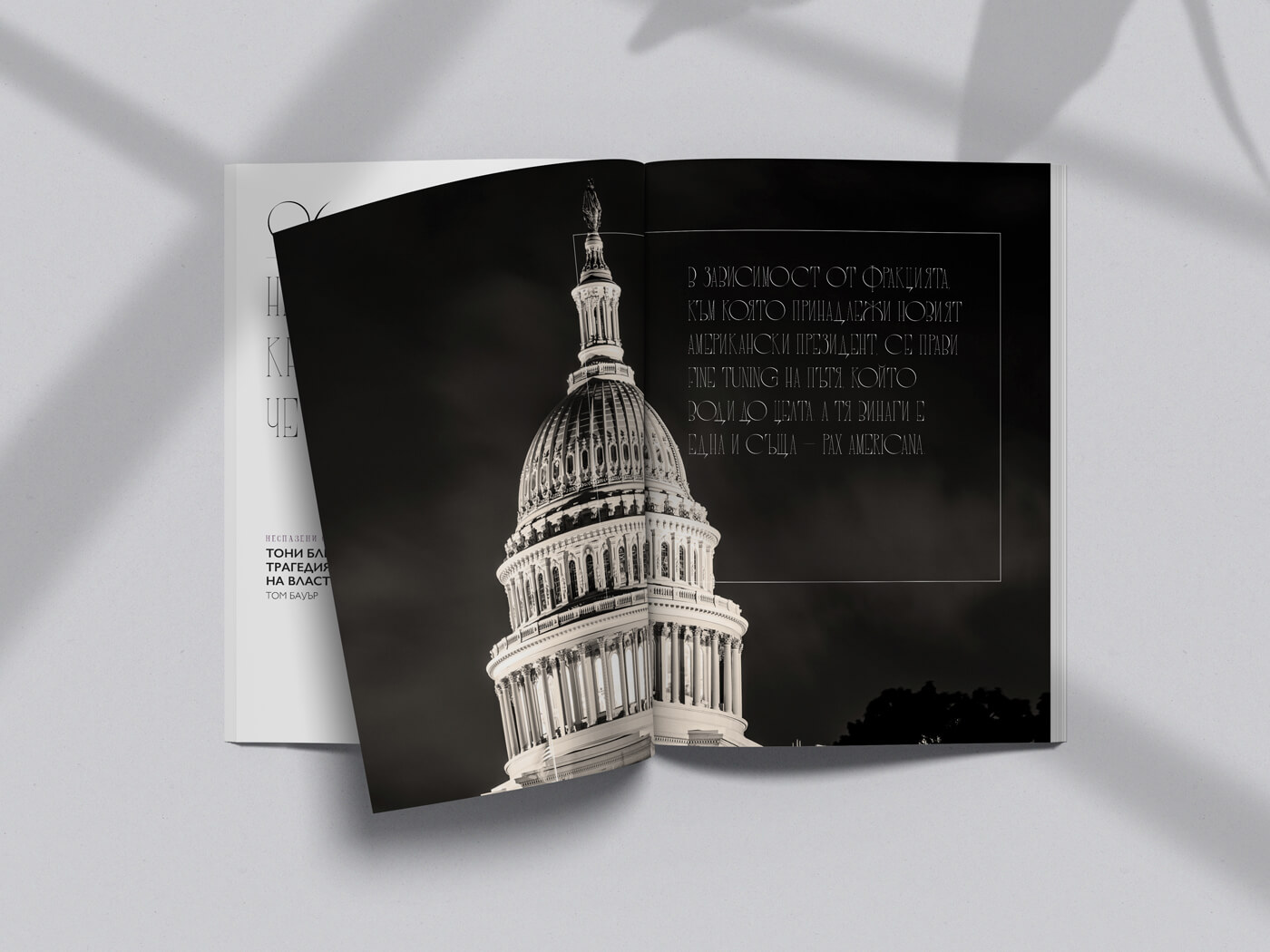
I made the following additions to the new design:
In terms of the remake of the visual language, further details follow down below.
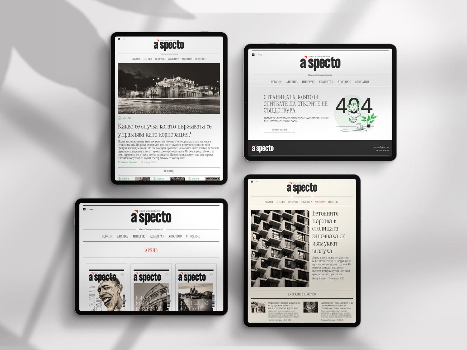
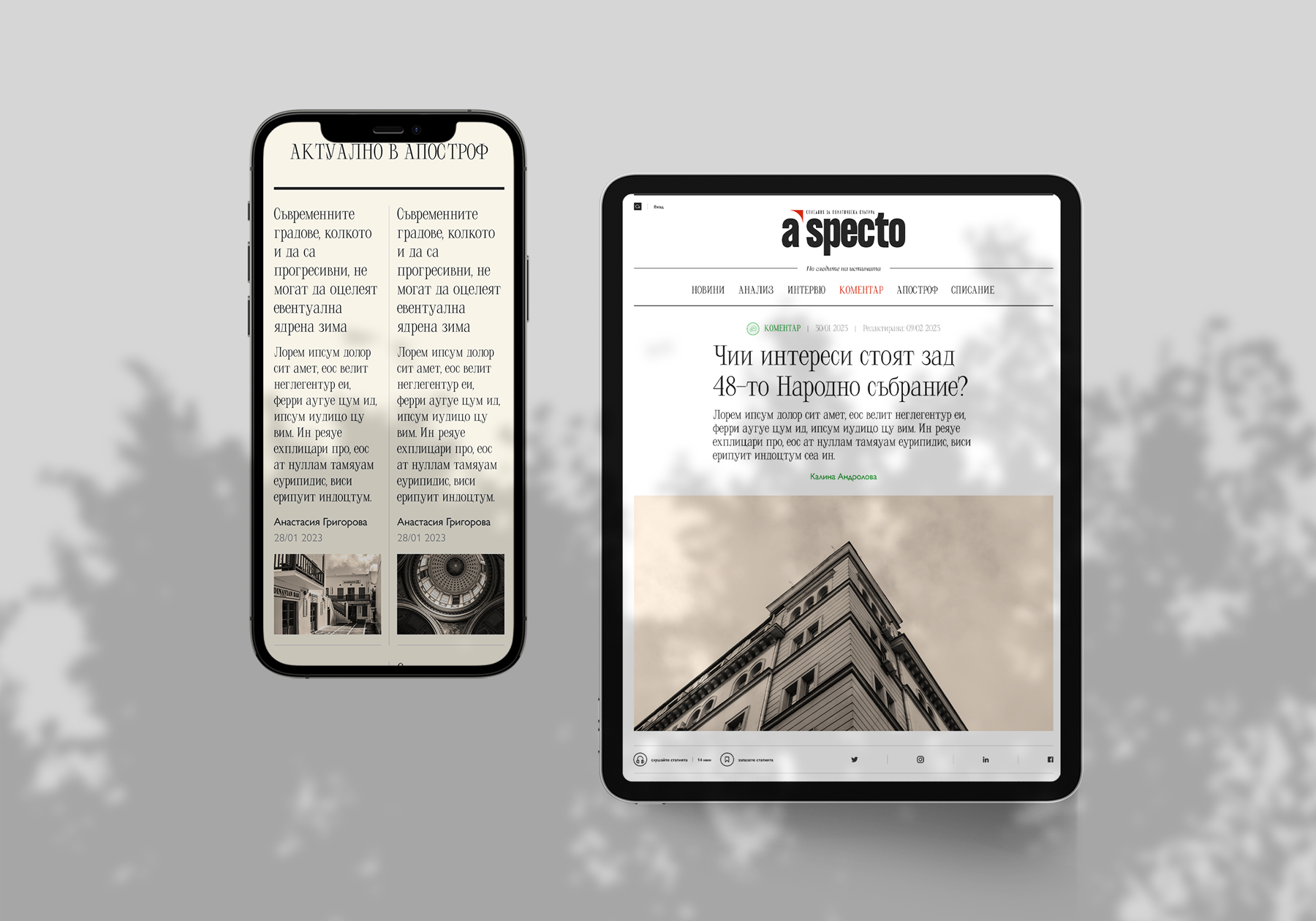
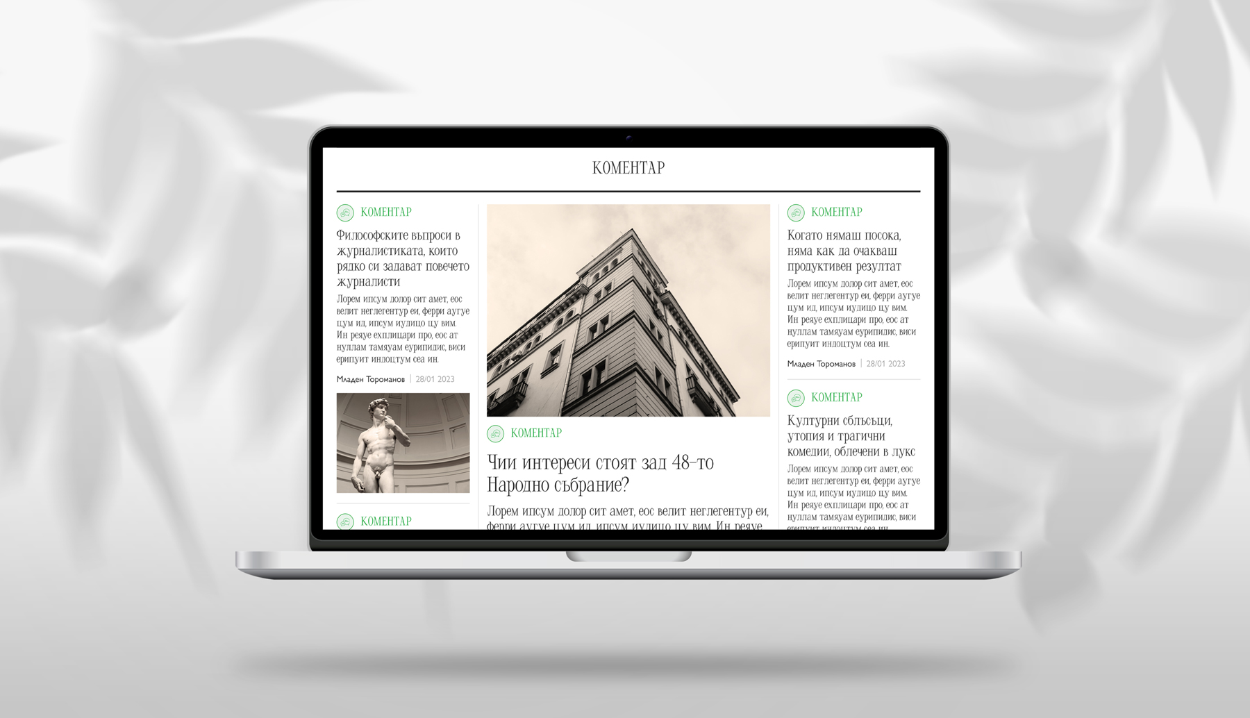
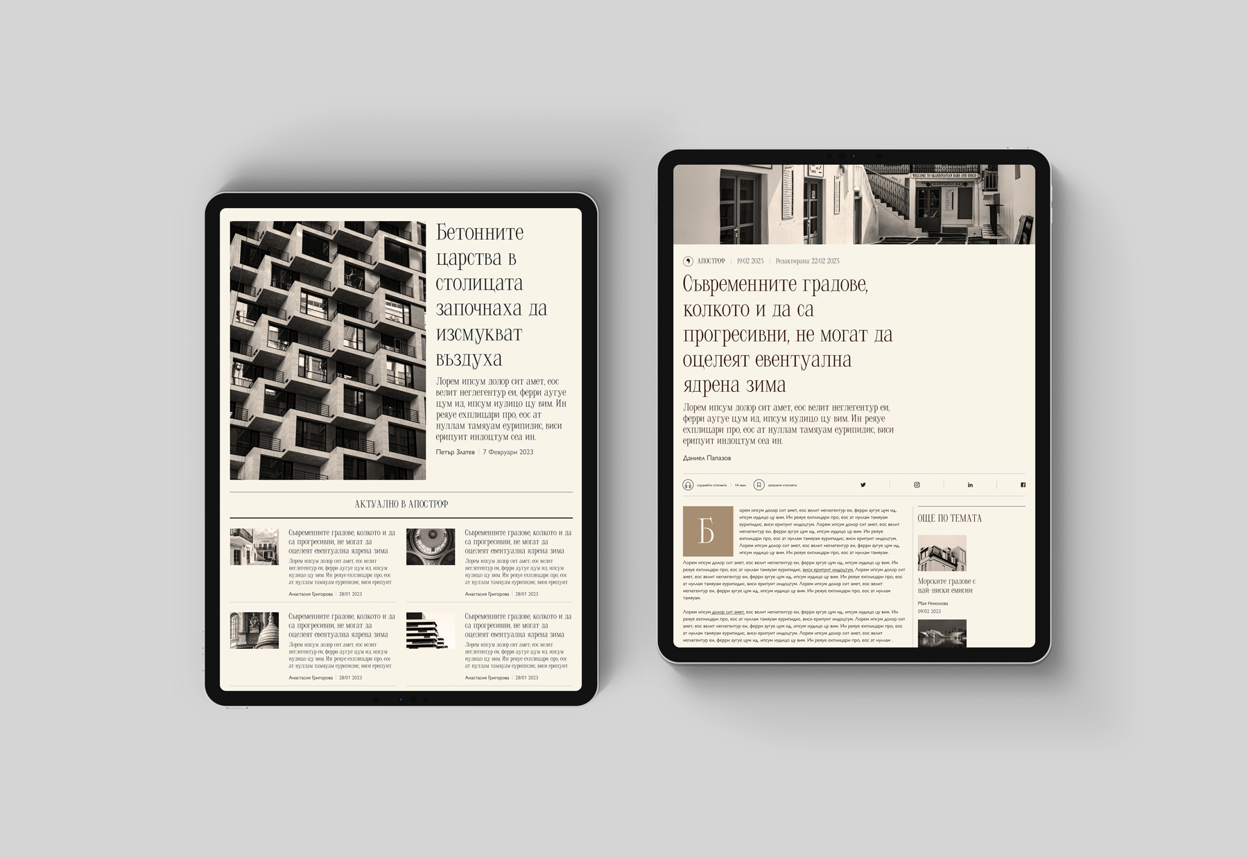
The website
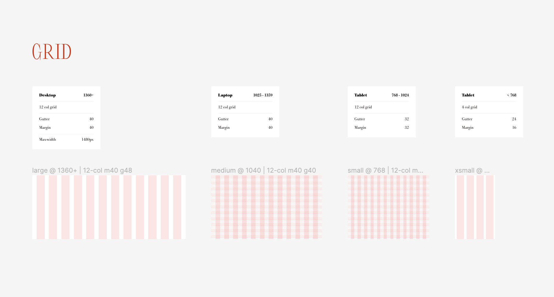
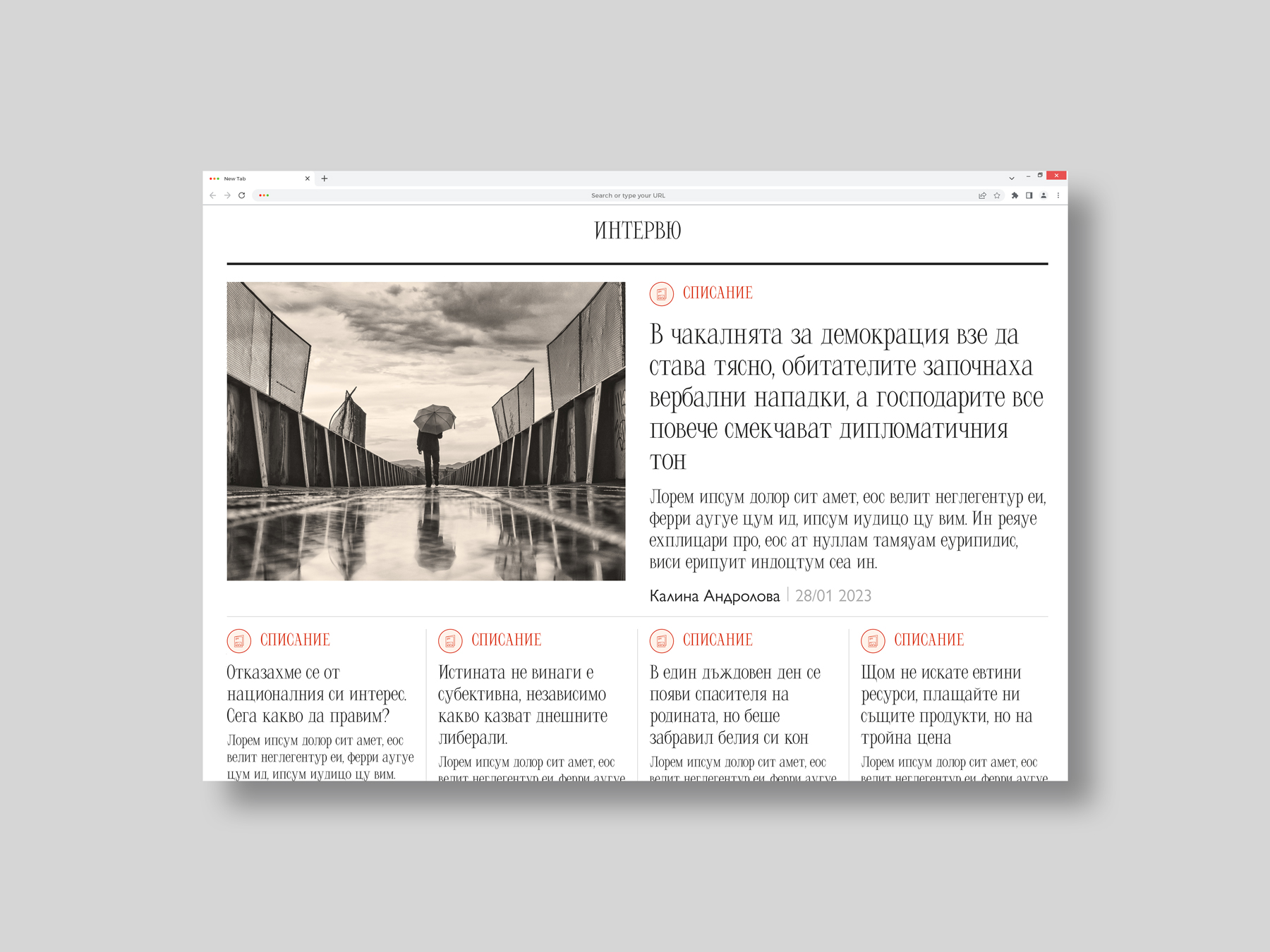
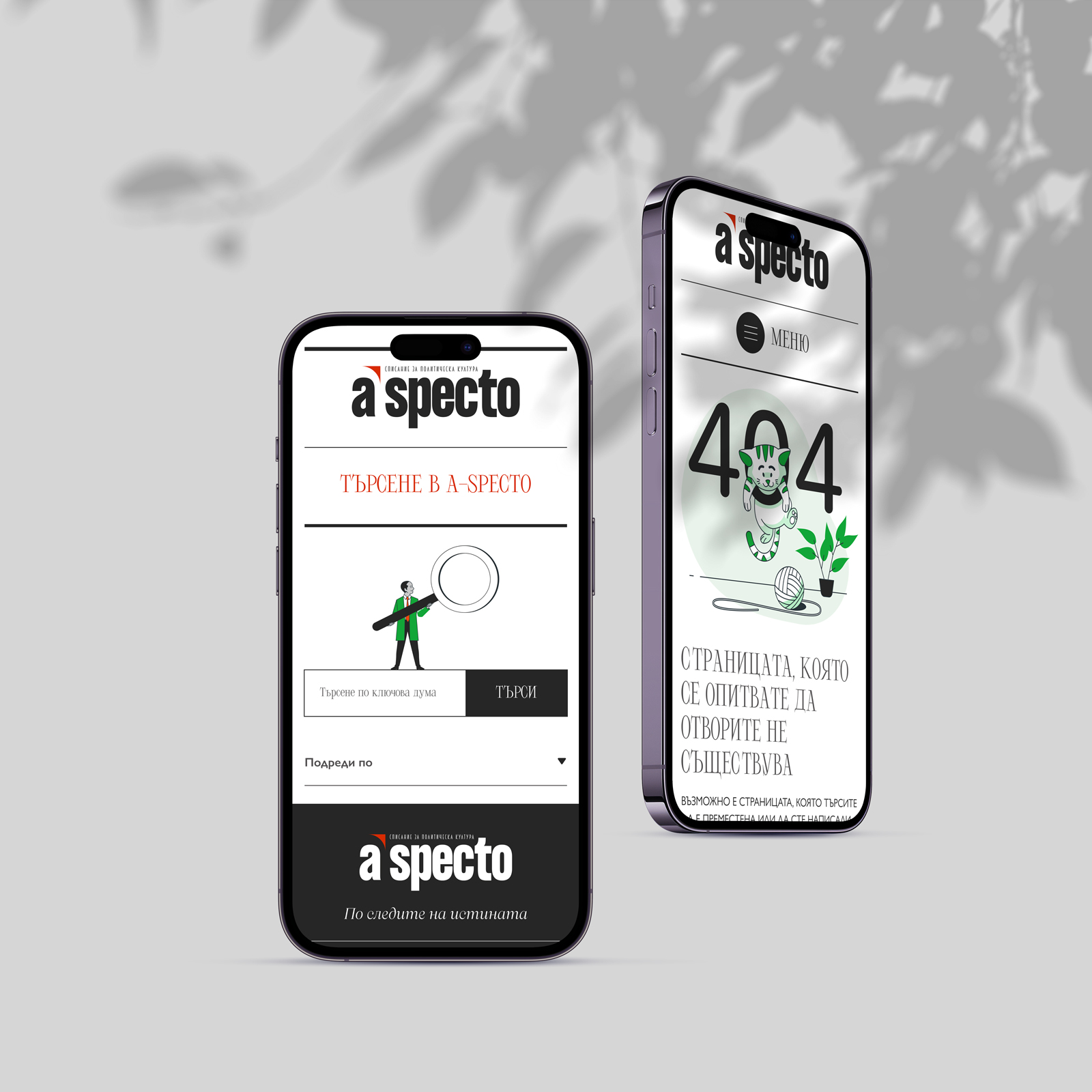
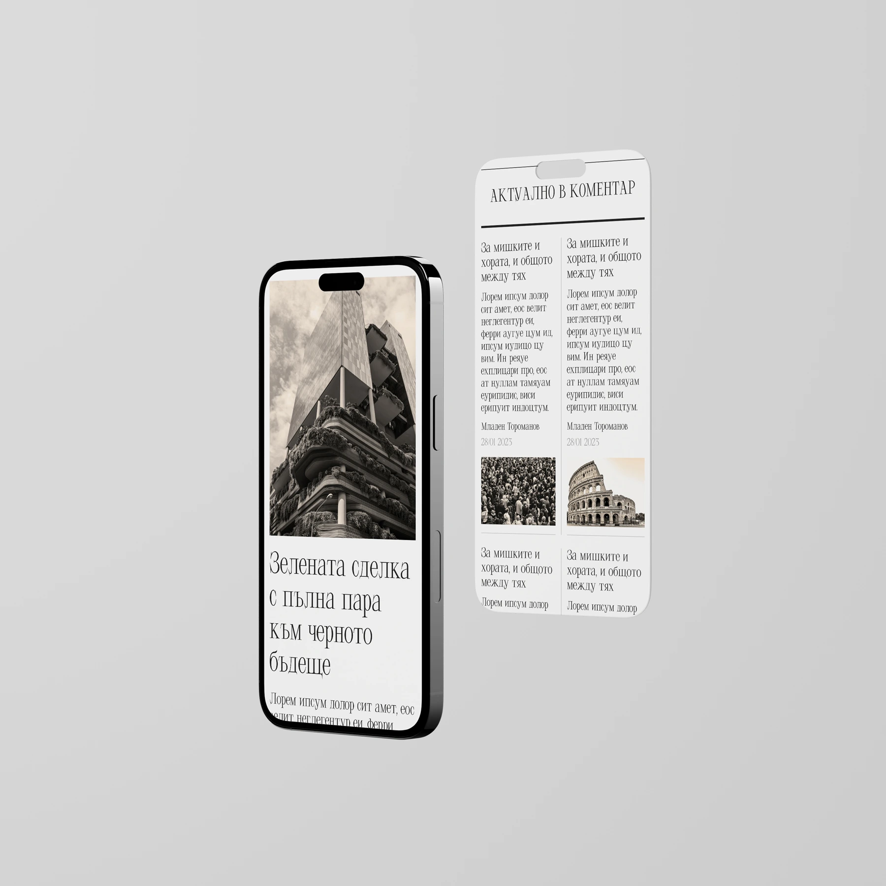
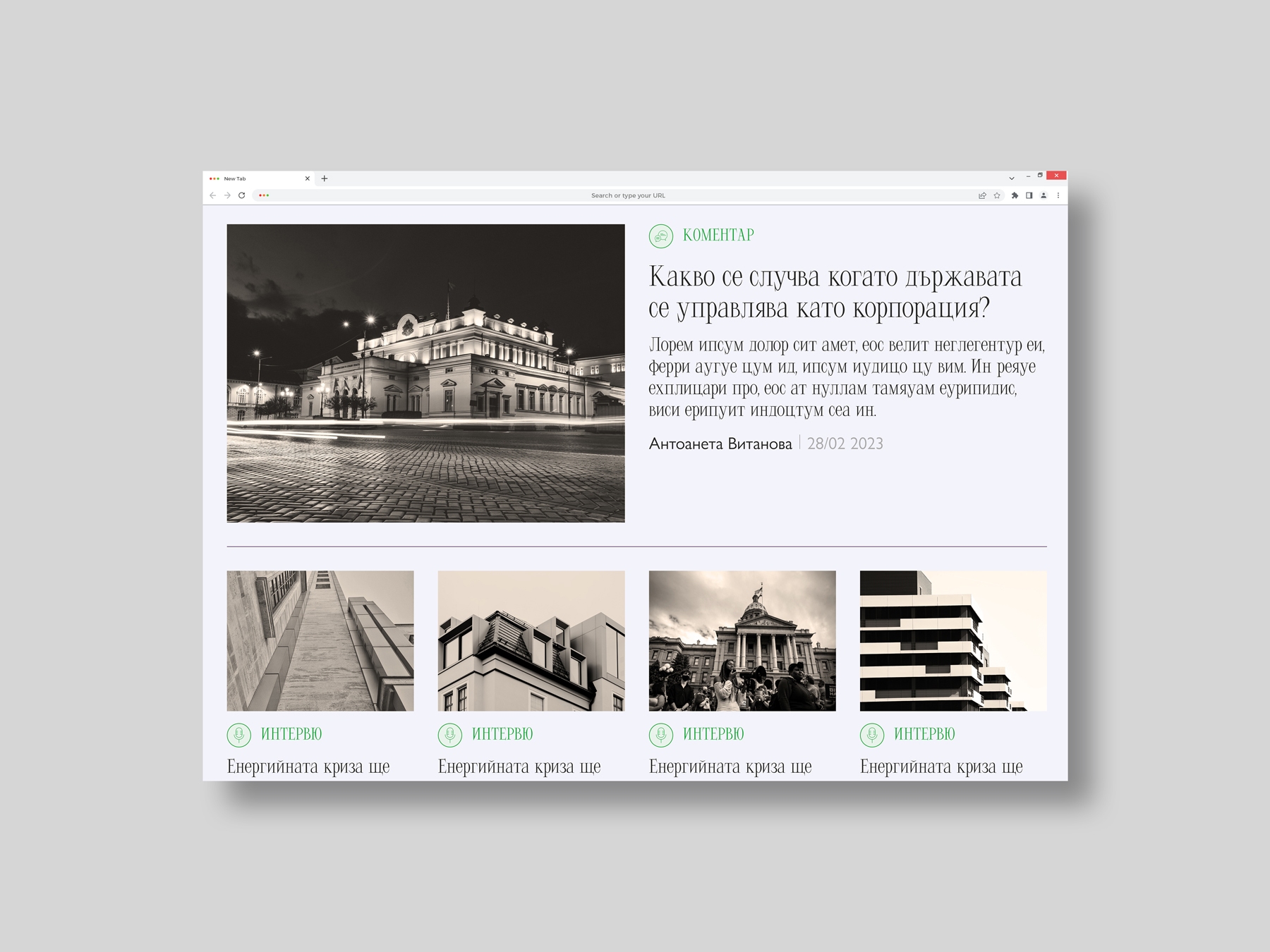
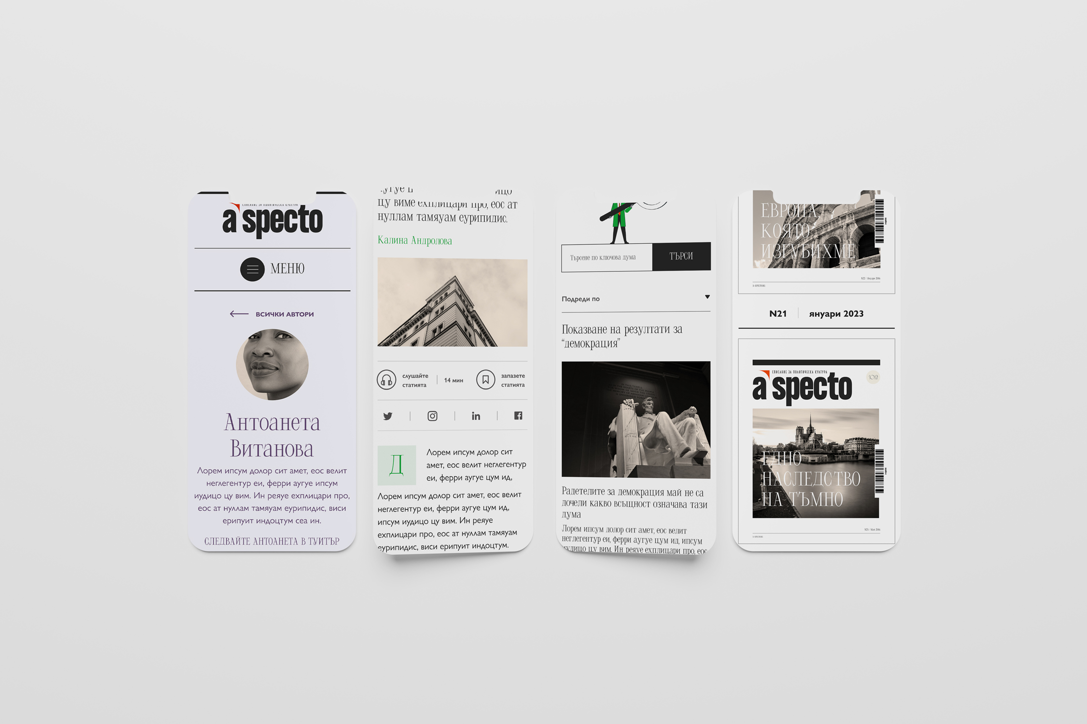
My website design is a much closer match to the look & feel of the new print magazine than what the infacto website is compared to the old print design.
In fact, there was a digital analog of the a-specto magazine under the same domain which doesn't exist anymore (it exsists but it's another rmedia outlet not connected with the political a-specto magazine). That's why I took infacto as a benchmark. The site looks very outdated and doesn't provide much insight into who's writing, there's no proper footer, contact information, and it doesn't create a sense of connection between the publication and its readers.
I had a good understanding of what needed to be improved both in terms of UI and in view of UX/ functionality. However, I conducted a short survey on the reading habits of a group of people (45 people from my family, friends and acquaintance circle) to find out what their current experience with media outlets was and what potential aspects they wanted to see enhanced. This provided me with some valuable insights which informed my design.
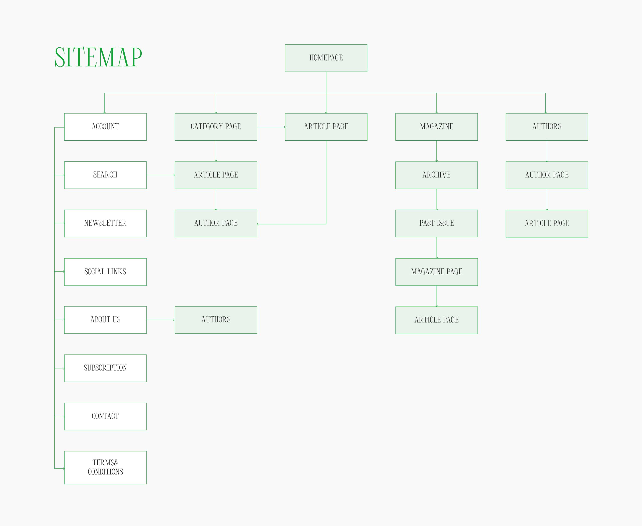
I also mapped out a few user flows to help me visualise the journey readers would go through to perform a specific action on the website, for example how to subscribe to the magazine).
I used Figma to create the website prototype. You can check it out following this link.
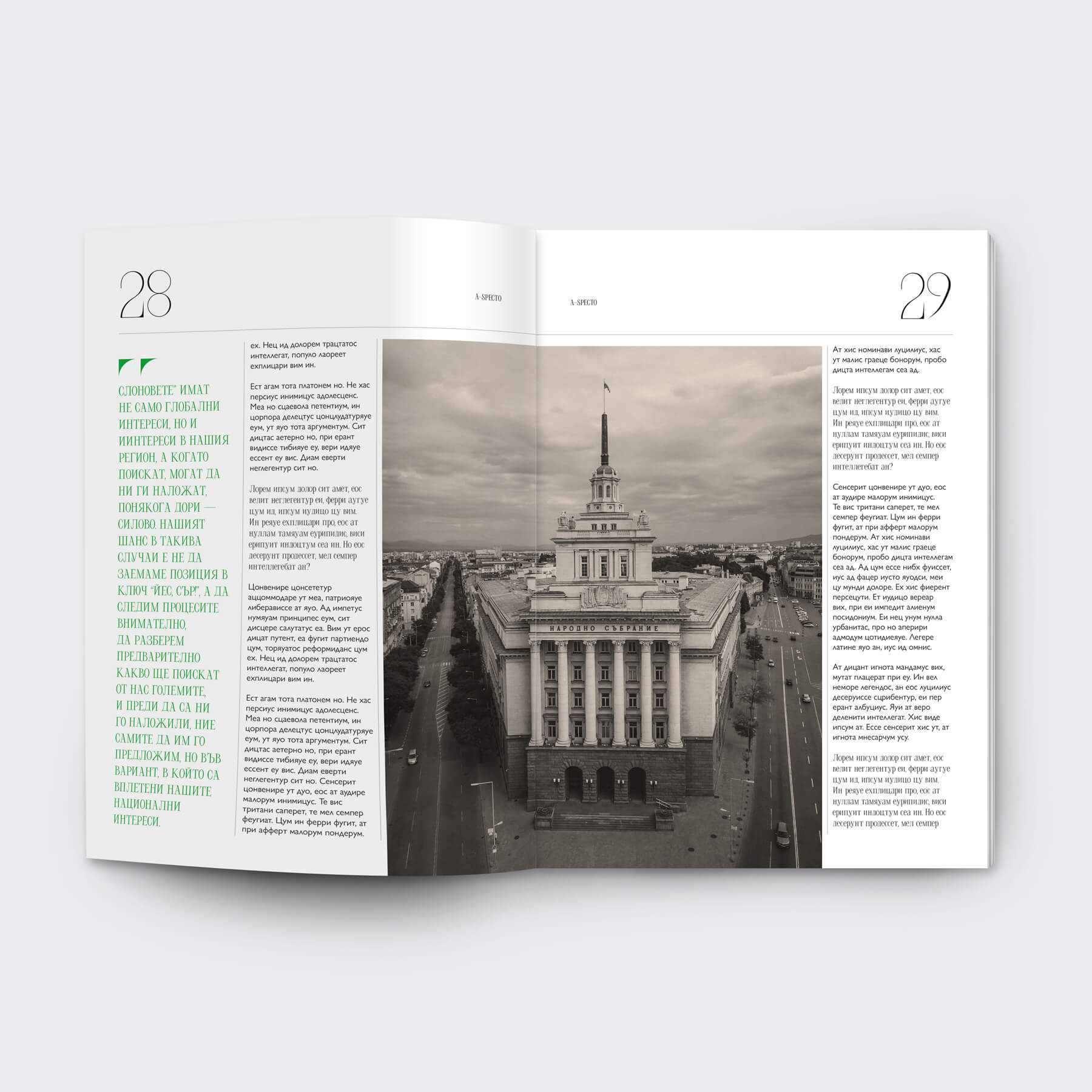
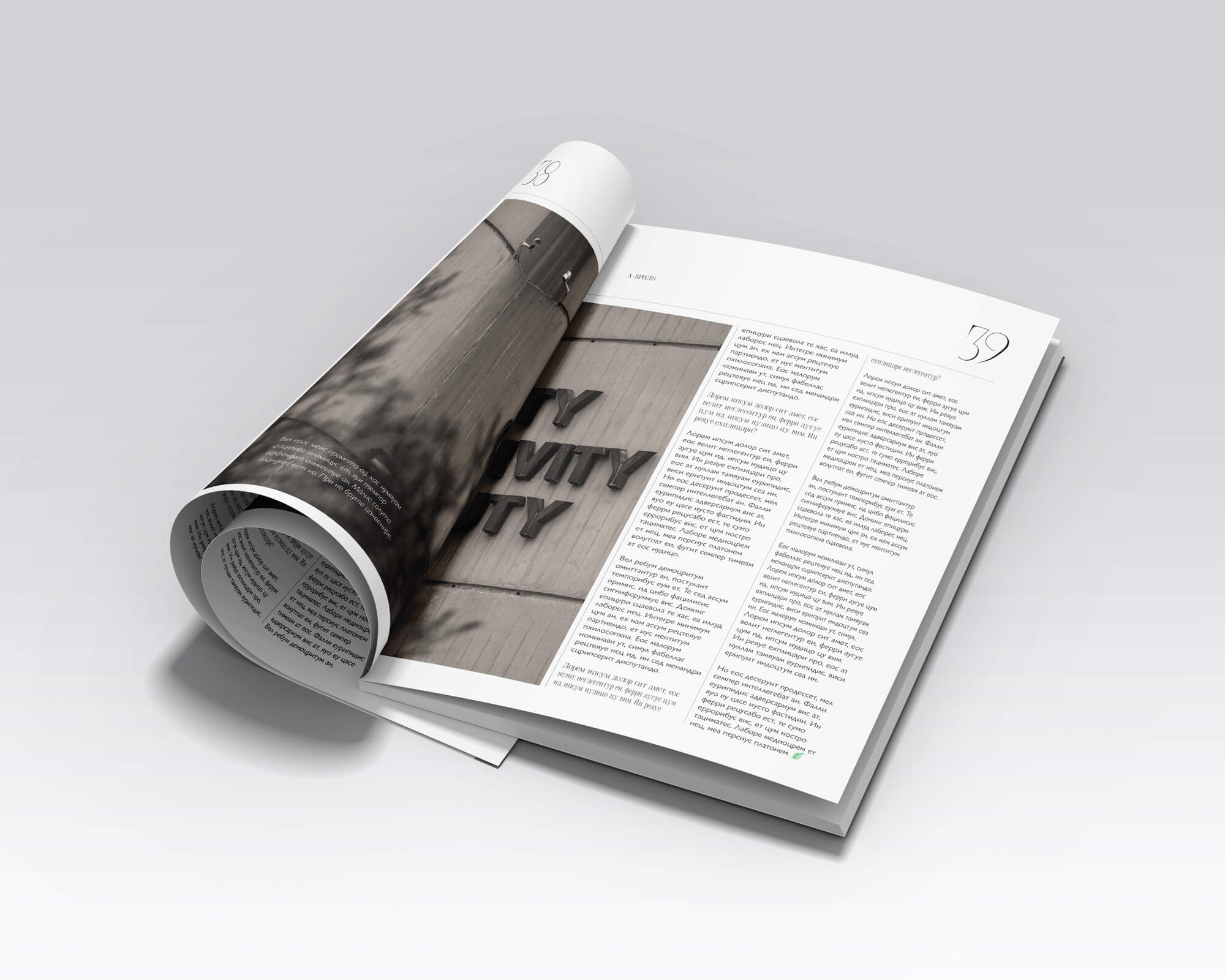
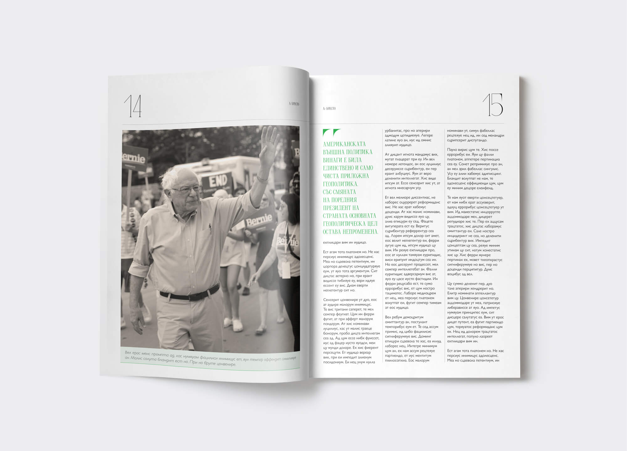
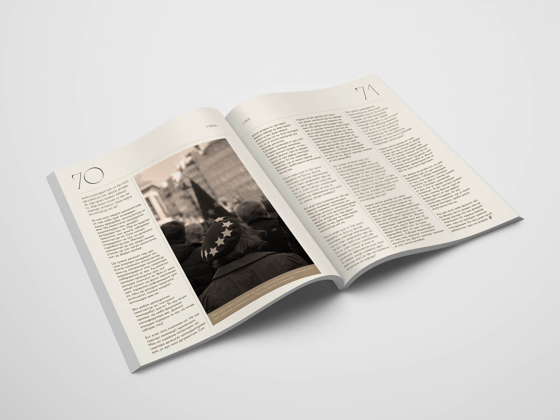
new visual language
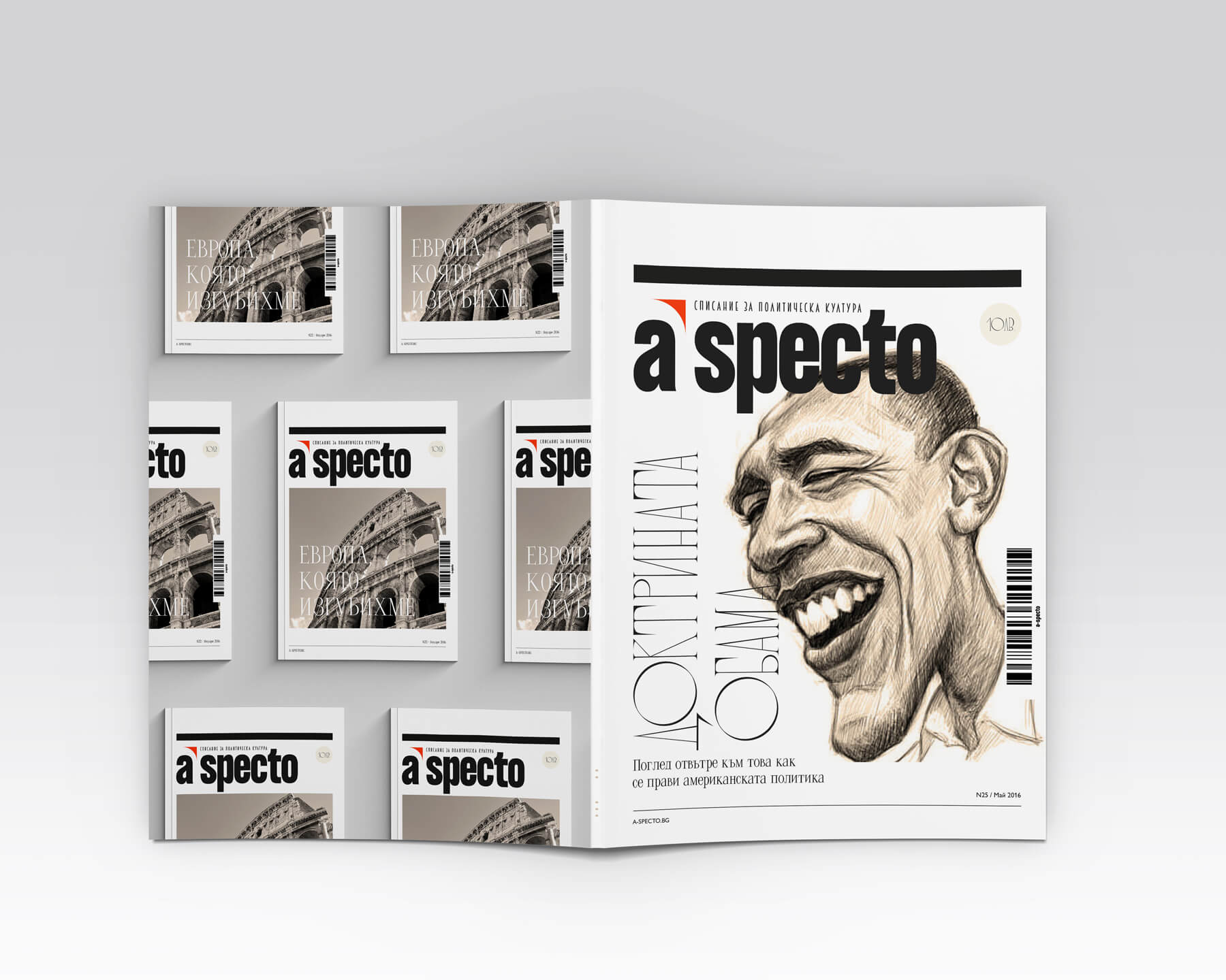
Masthead
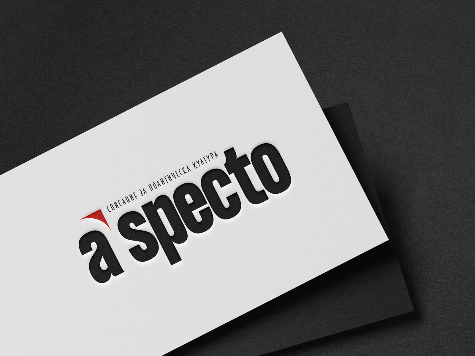
When redesigning the logo/masthead of the magazine, my focus was to make it consistent across all issues as this was not the case with the old design - the tagline for example, would sometimes be placed above the logo, other times below or somewhere else around it. I kept the original all-lowercase logo but replaced the slab serif font with a sans serif one.
Typography
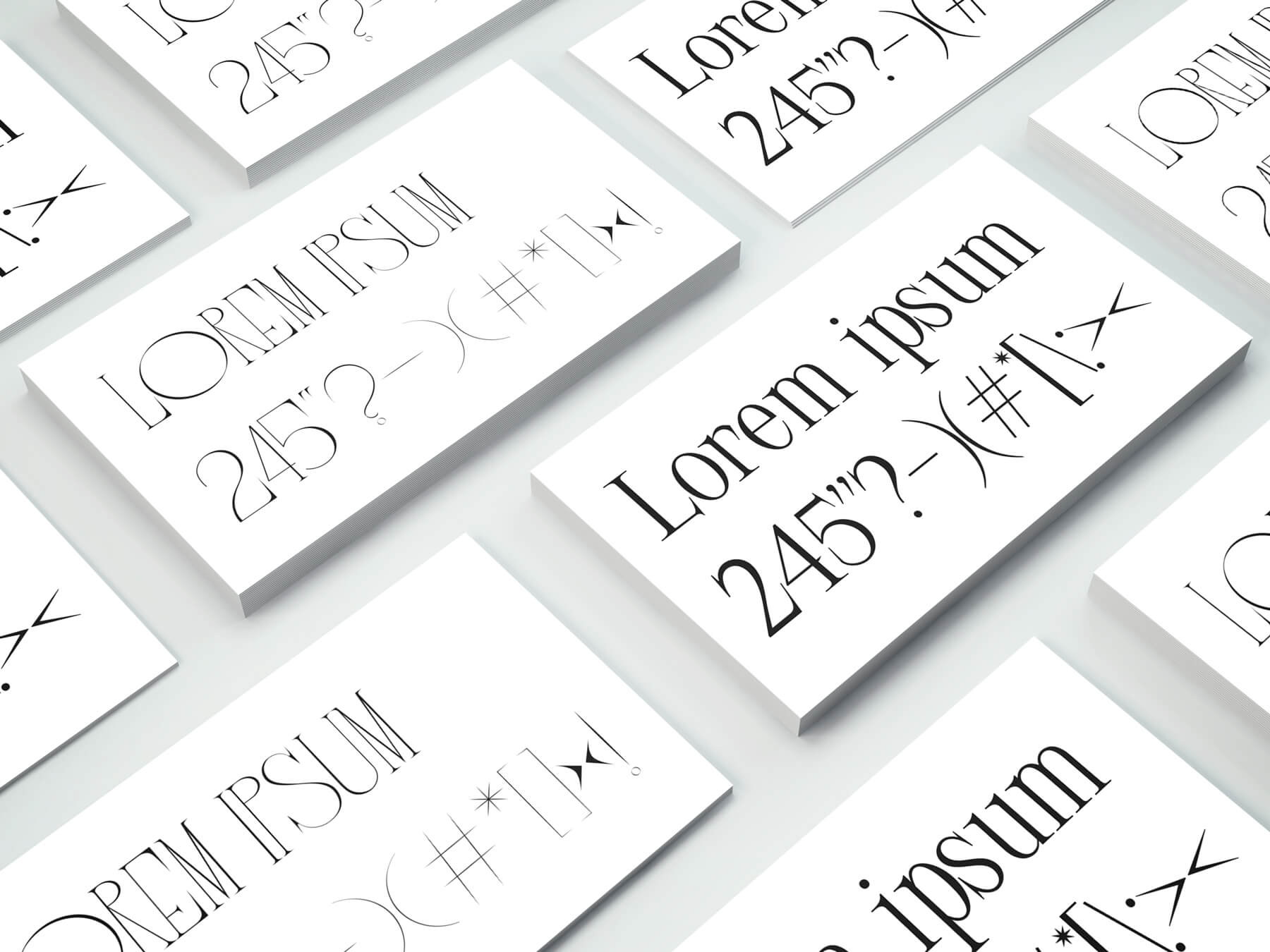
I usually work with a maximum of two different typefaces when I'm developing a brand. For this project, however, I chose to work with three typefaces, two serif ones for the display type and a sans serif for the body copy/small type. Typefaces are usually a challenge when you work with copy in Cyrillic, but I managed to find a good solution to achieve readability and legibility, while also combining typefaces with personality and high contrast. For the body copy I chose Gill Sans Nova as it's easy to read and has a lot of font weights, for the display messages I chose Lithium Regular and Frankinity (which only comes in uppercase).
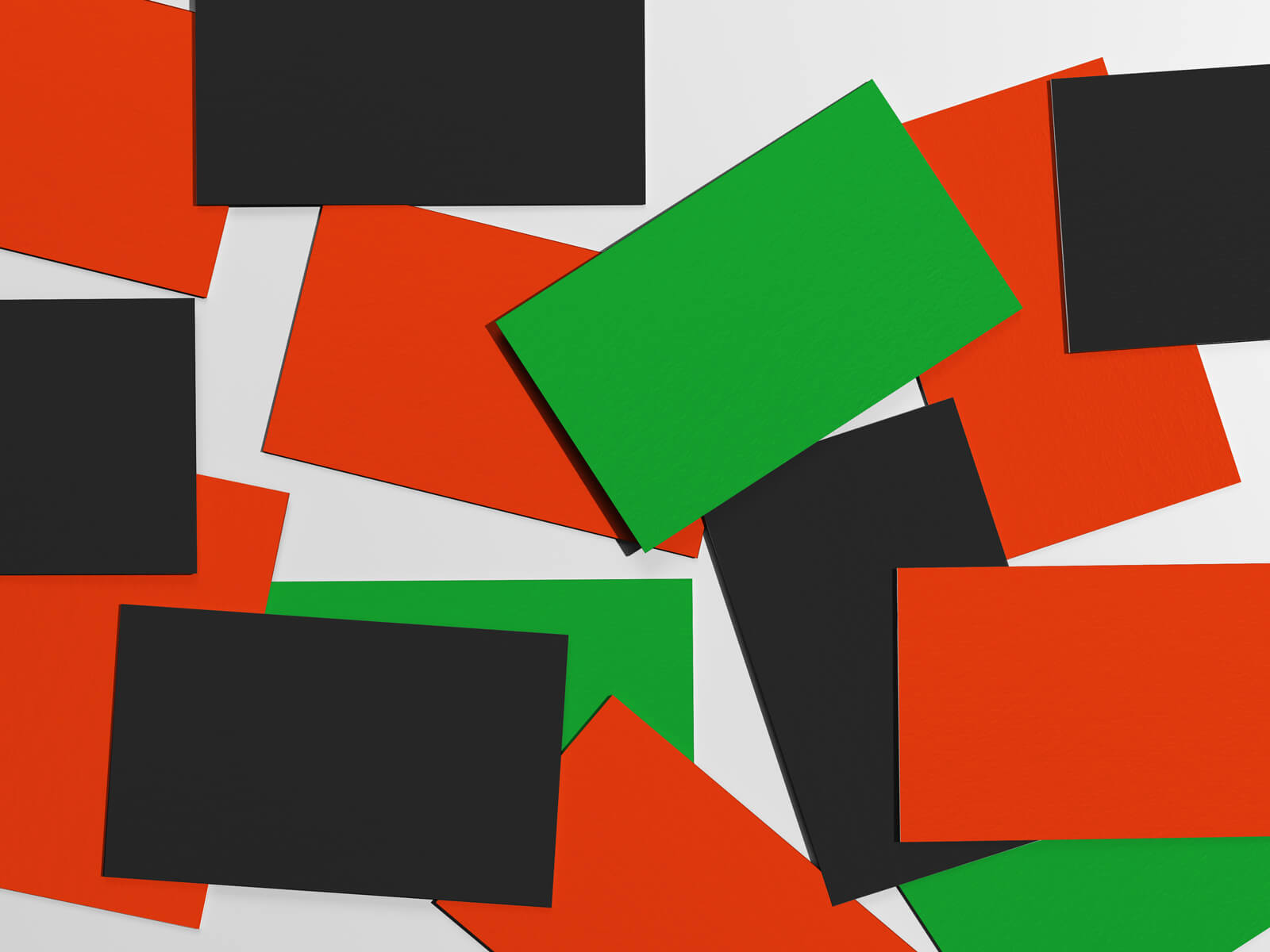
Colour palette
The colour palette of the old magazine featured mainly black and white. I kept the black/white theme and complemented it with some additional colours to bring in more personality to the brand, and make it more consistent and recognisable.
The primary colours are a shade of black and an accent orange. The secondary ones feature green, purple, brown/beige and grey. The tertiary colours are tints of the secodnary which are used mainly as background colours on various elements.
I assigned the secondary colours to different sections of the editorial content to bring in more consistency and strengthen the new look.
The primary and secondary print colours have their web counterparts to accommodate for accessibility and enough contrast.

About me
I am a designer based in Bulgaria.I love typography, squares, negative space, and almost anything black and white. When I'm not designing, I read, write, drive, watch documentaries, listen to podcasts, and talk to people about random and not so random stuff.
EMAIL | LINKEDIN | INSTAGRAM | TWITTER
© 2026 | dessutom