
EDITORIAL/GRAPHIC DESIGN
pins & needles - tattoo magazine
pins & needles is a magazine I designed as my final assignment for a university course on editorial design. We were given the freedom to choose the subject of the magazine and since I like tattoos, I designed a magazine about the tattoo culture.
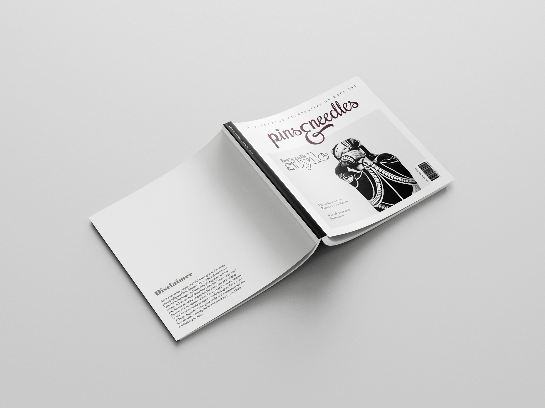
DISCLAIMER: some of the images I used on the pages are solely owned by the tattoo artists I've featured in the magazine. I claim no rights to them, I've only used them to highlight their work.
the project @ a glance
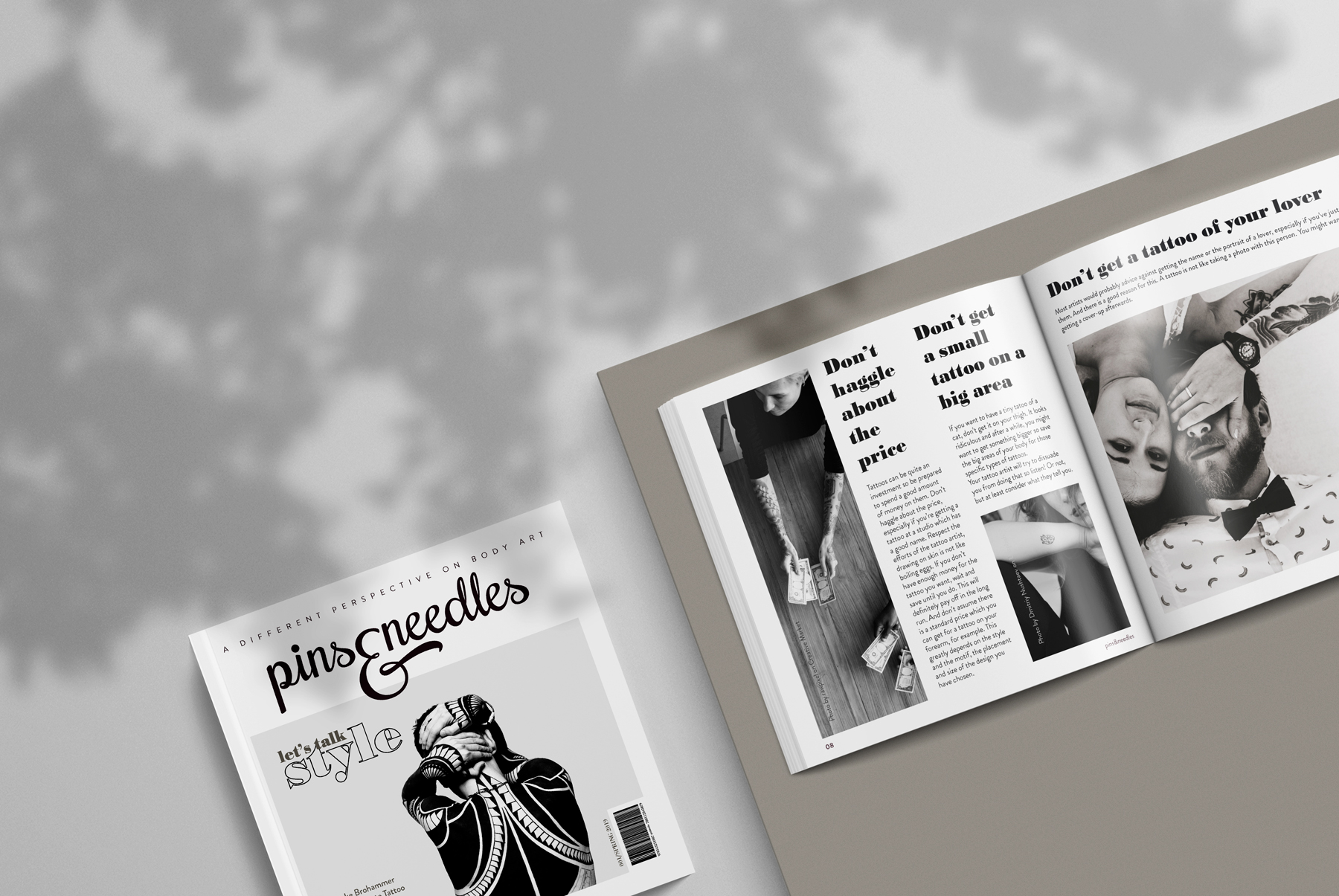
I did not quite like the image that most of the existing tattoo magazines attribute to the tattoo culture. Most of them rely primarily on nudity and cluttered and busy layouts. This is not how I perceive the tattoo culture so my aim was to design a magazine which presented a different perspective on the topic. I also did not like the fact that most tattoo magazines' names included the word tattoo. I called my magazine pins&needles because the expression describes well the process of getting a tattoo and is connected with the topic but not in an obvious way.
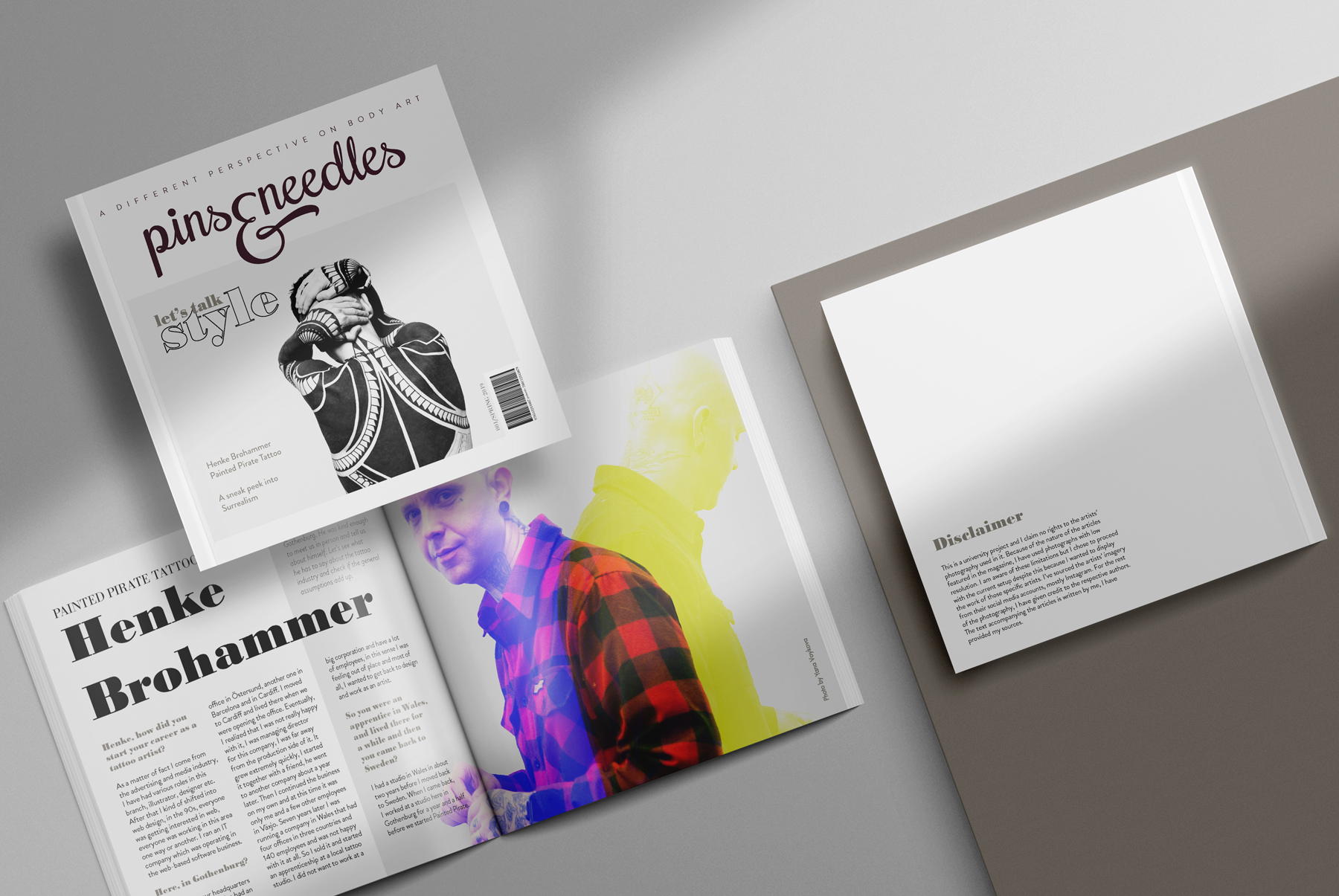
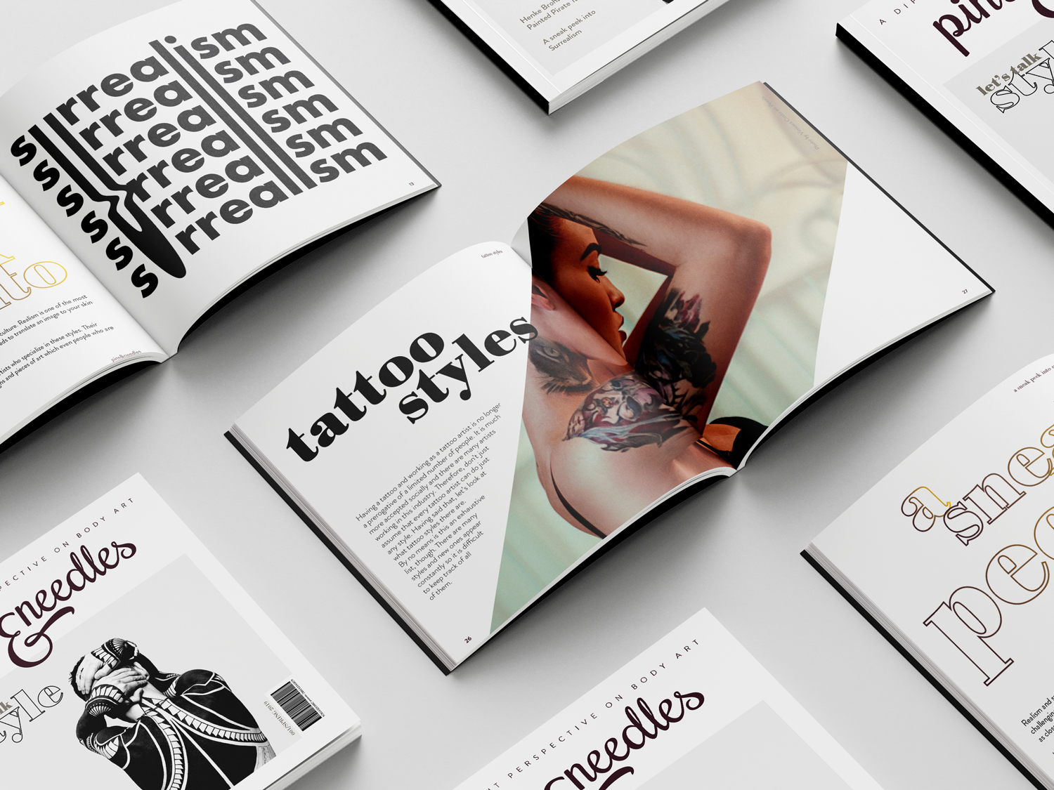
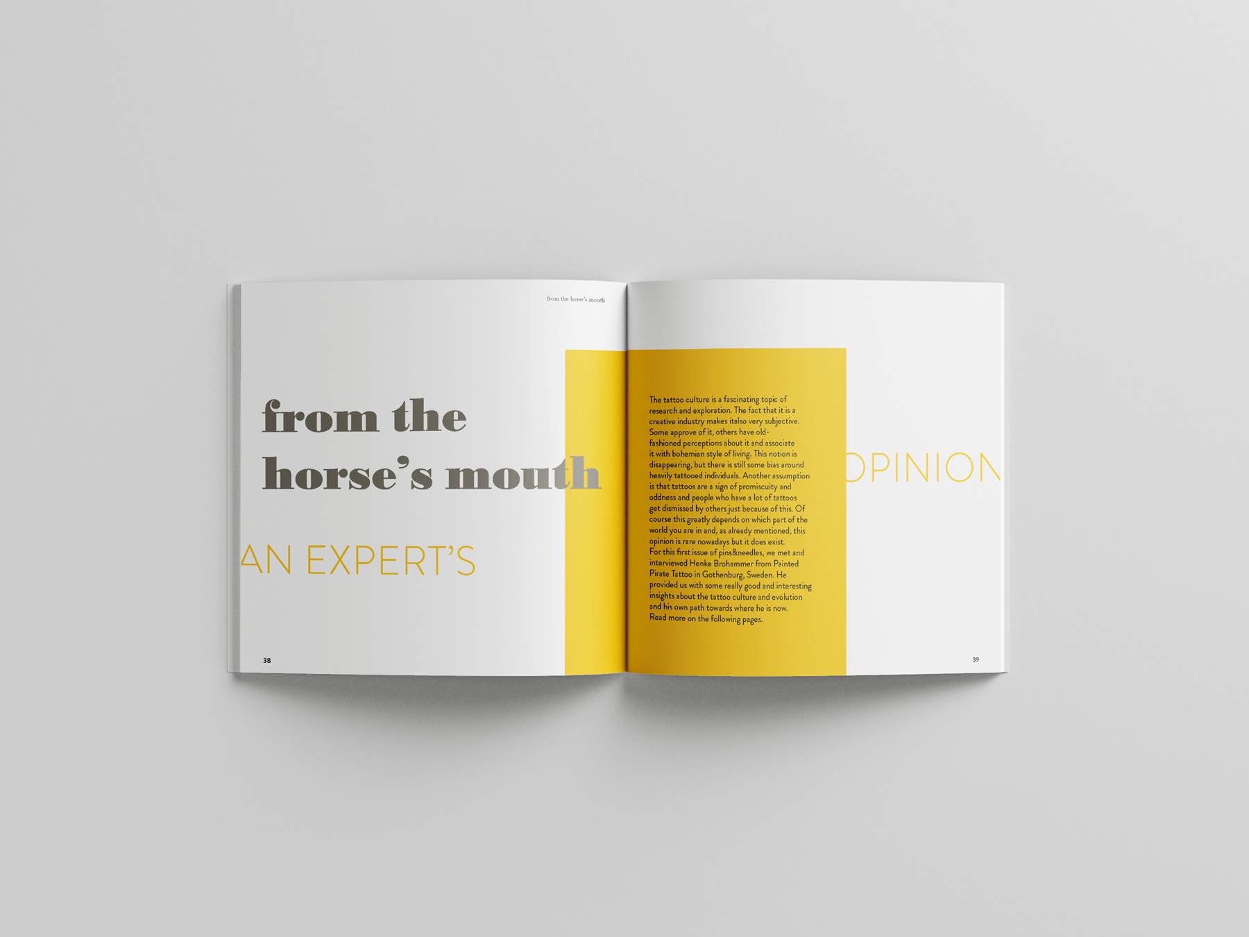
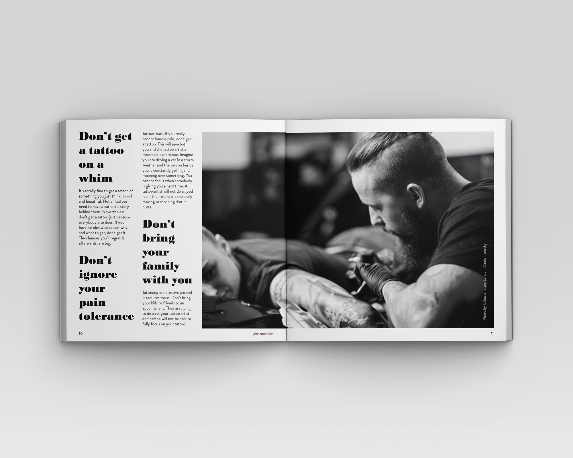
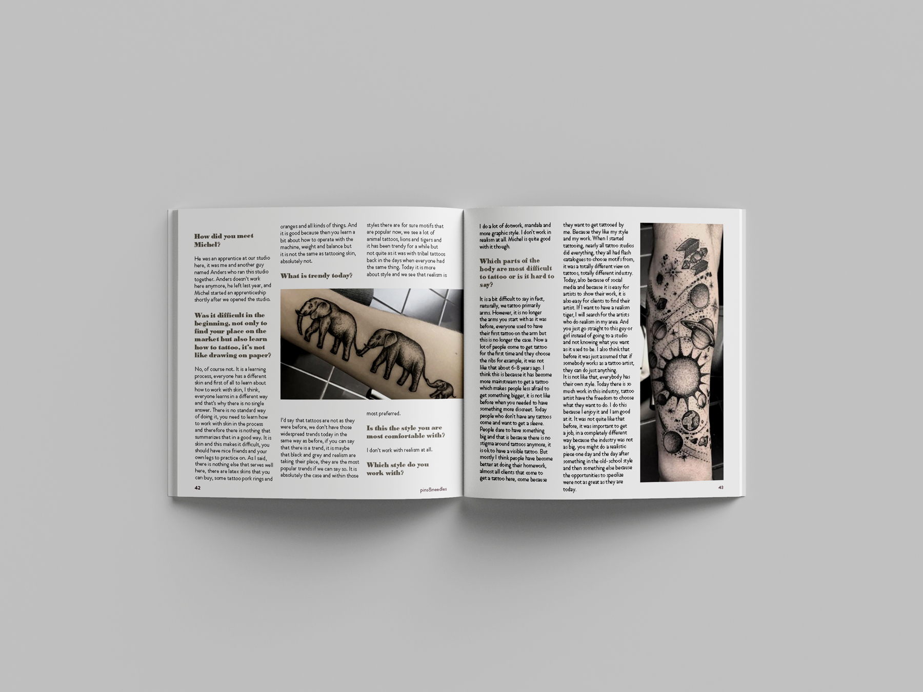
I wanted to conduct interviews with tattoo artists so that I would publish information which I had collected myself and not just copy-pasted from the internet. I reached out to quite a few tattoo artists but most of them were either too busy or did not respond. A local Swedish tattoo artist from Gothenburg, Henke Brohammer from Painted Pirate Tattoo responded very quickly and we met for my interview. The rest of the information that I needed for my articles I gathered online but wrote the articles with my own words, based on the materials I reviewed and my own experience.
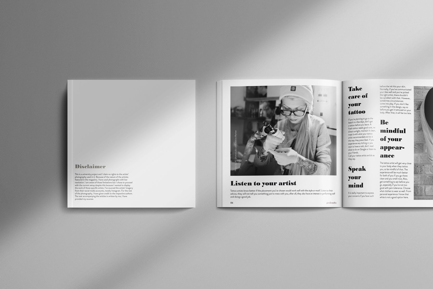
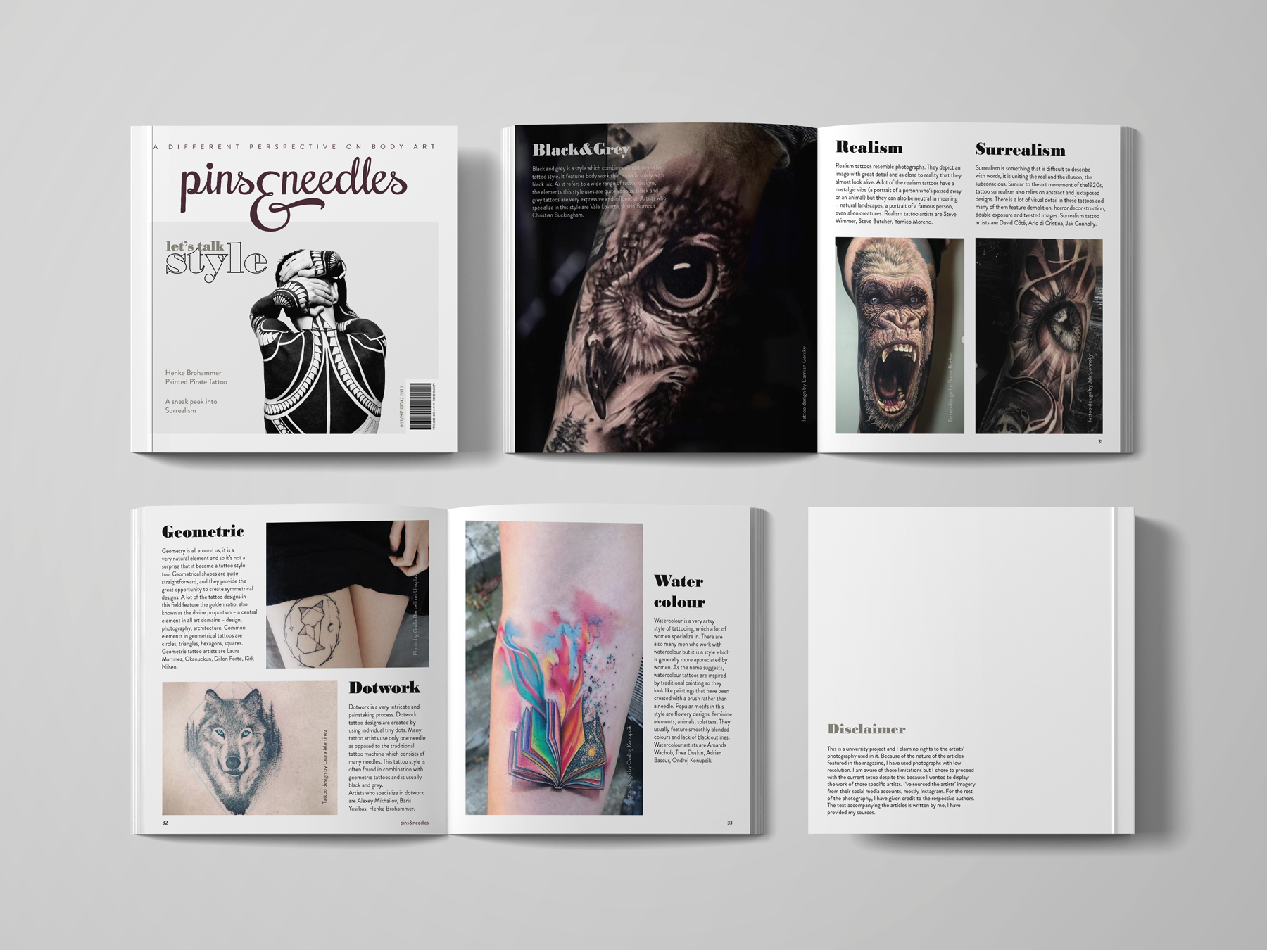
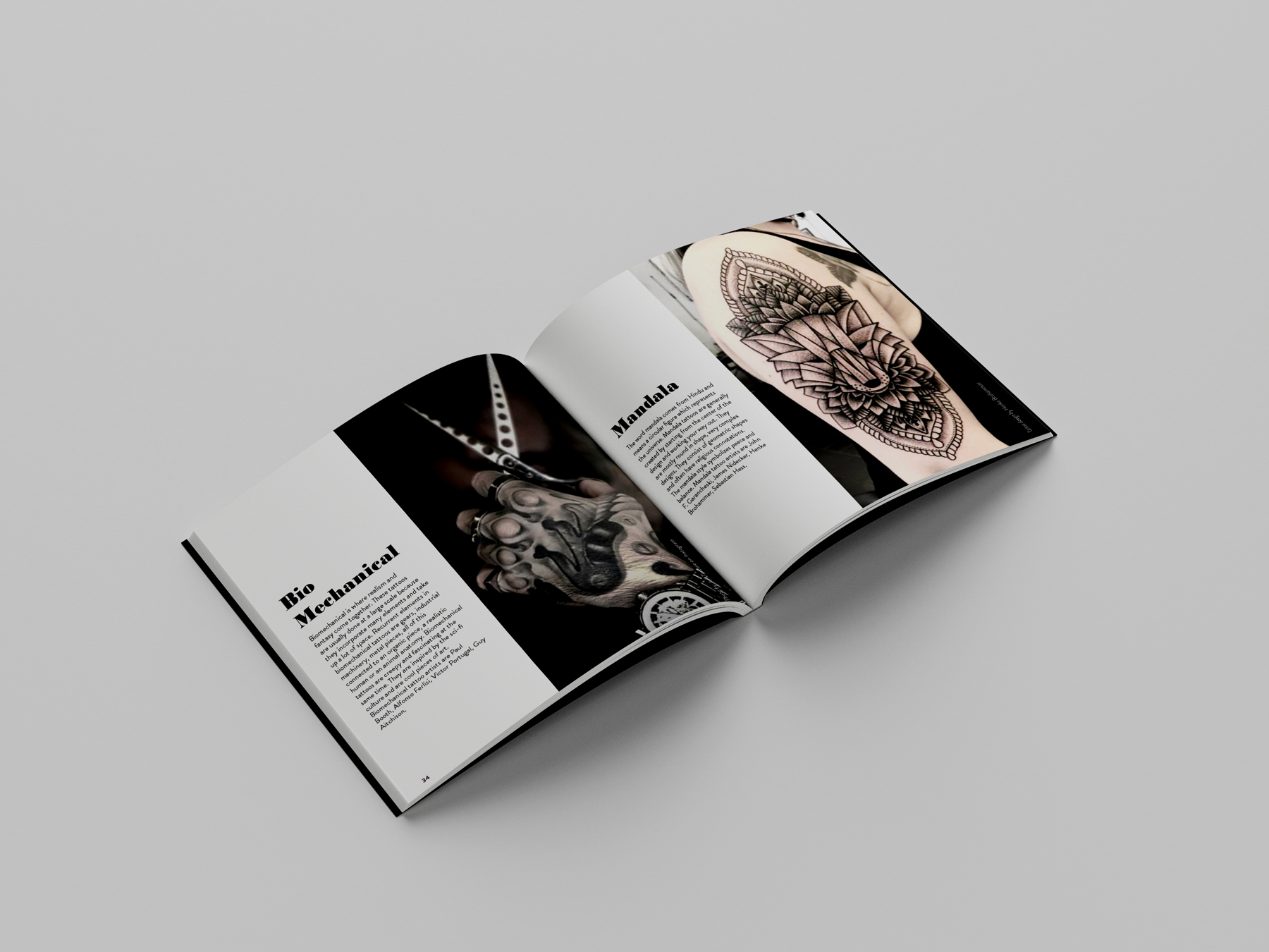
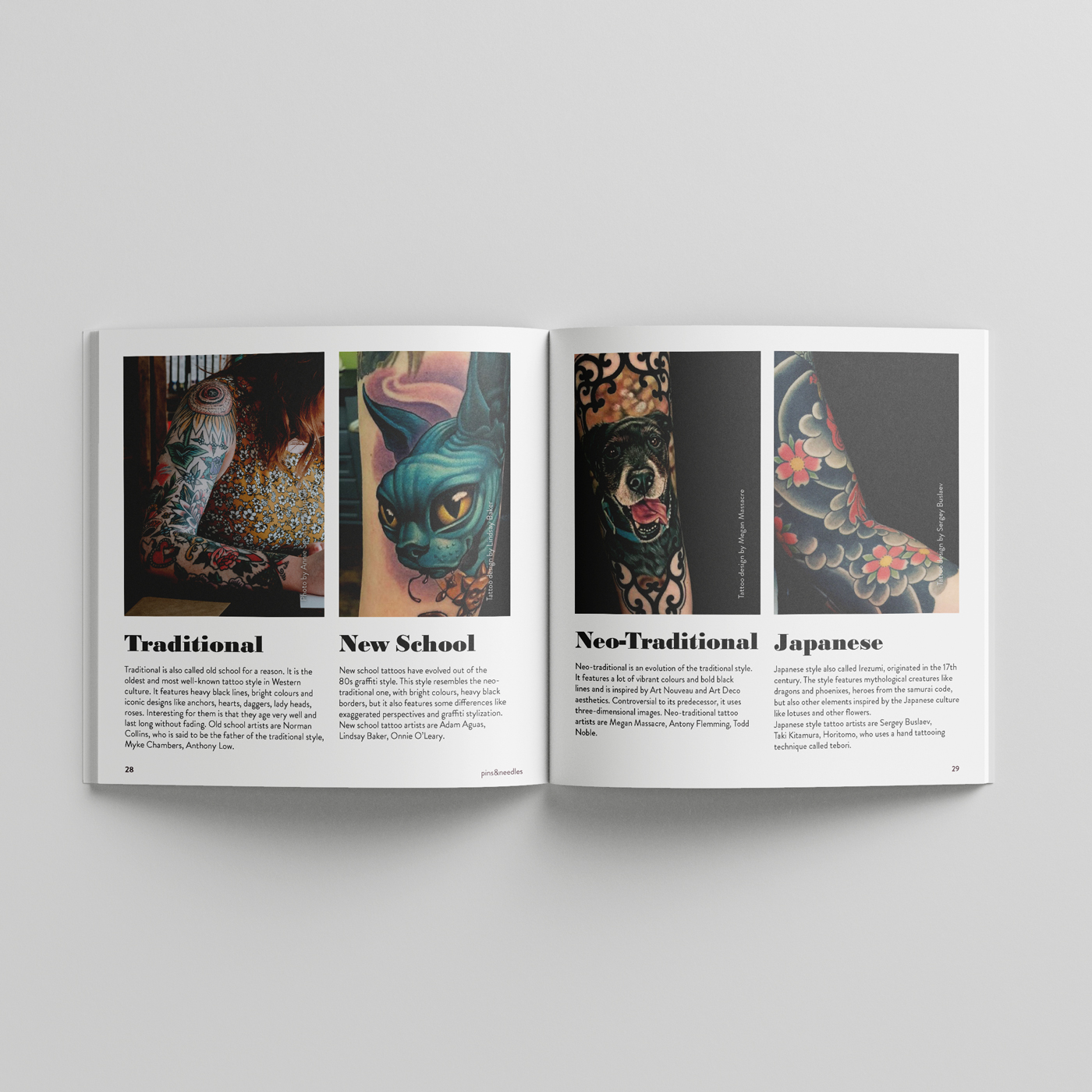
While I was researching, I discovered very talented tattoo artists whom I wanted to feature in my magazine. This came with some limitations though, like the photography I was going to use. Most tattoo artists did not have high-resolution images of their work and more importantly, I did not possess the rights to their photographs. I decided to proceed with the initial setup anyway because I really liked those tattoo artists and wanted to display their work. I included a disclaimer at the back of the magazine explaining these limitations.
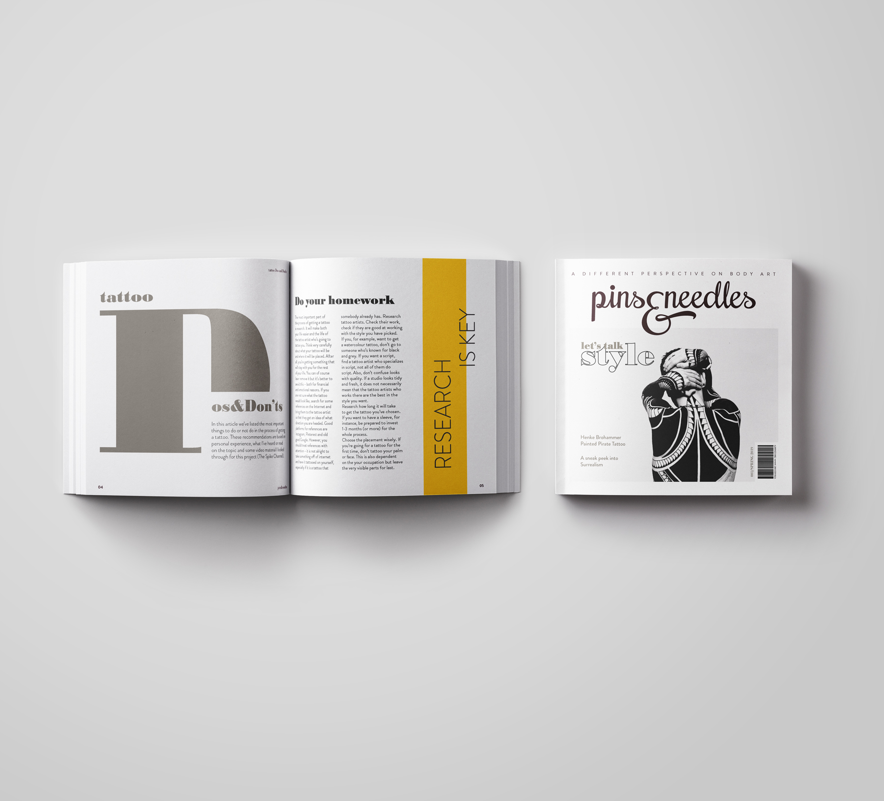
I love squares. This is why I chose a square format for my magazine. In addition, squares, being a geometric form, are an integral part of many tattoo designs.
Another reason I chose a square format was as a differentiator from the competition ⏤ most (tattoo) magazines are published in an A4 size format.
Visual language
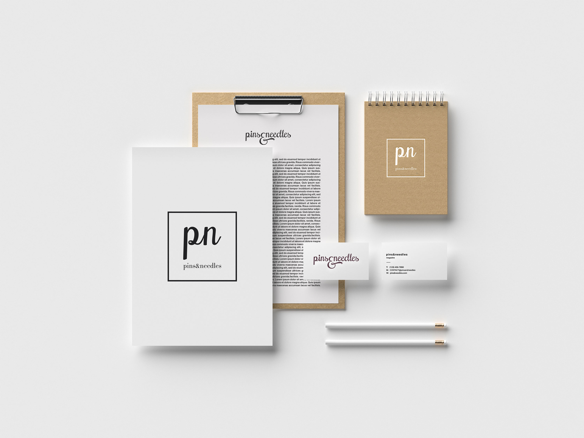
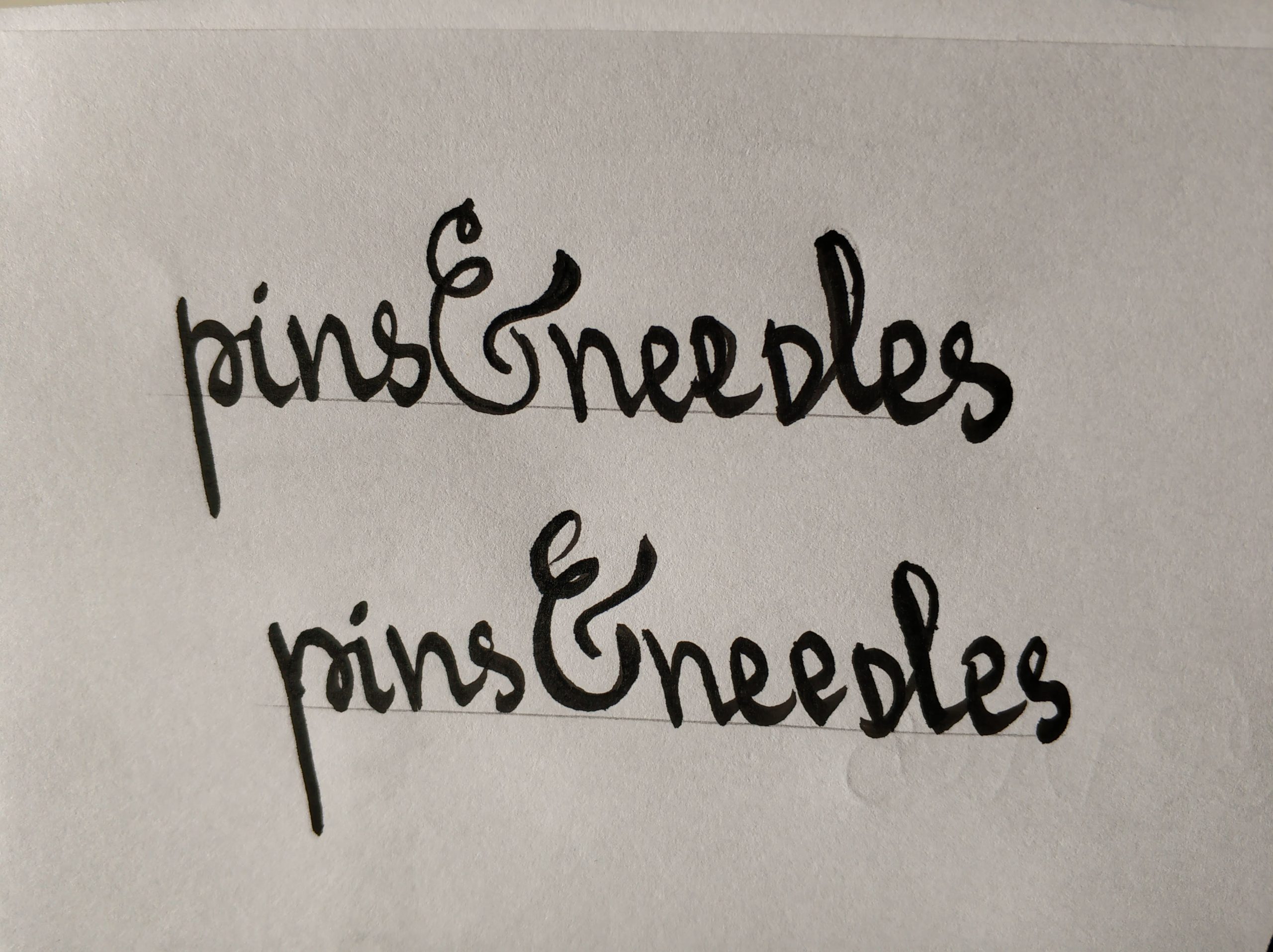
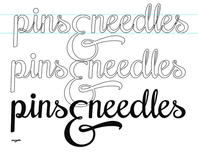
MASTHEAD: I wanted to design a typographic masthead. I started sketching and trying out how it could look like. I wanted it to be handwritten so that it resembles script tattoos. Of course, I had legibility in mind throughout the whole process.
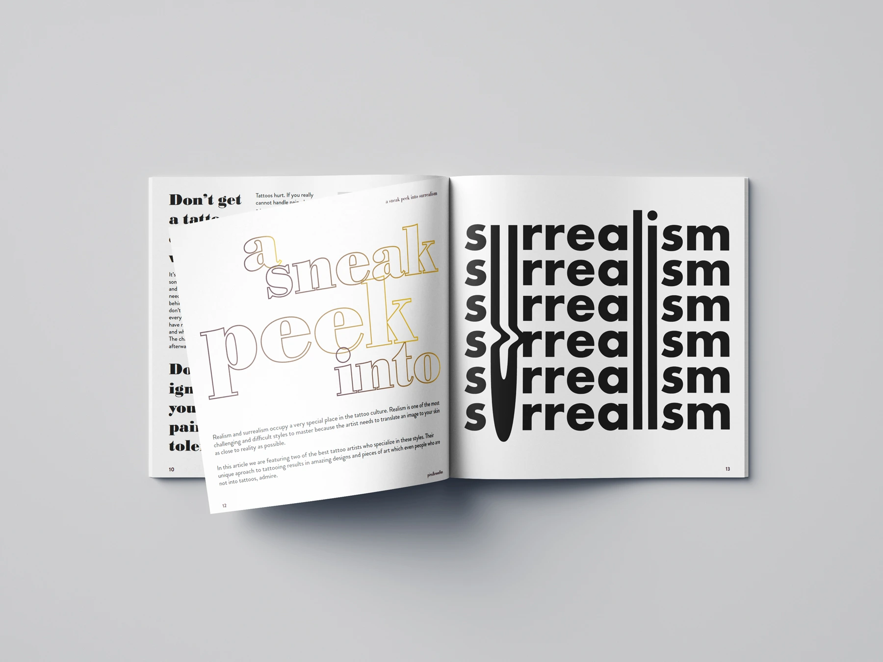
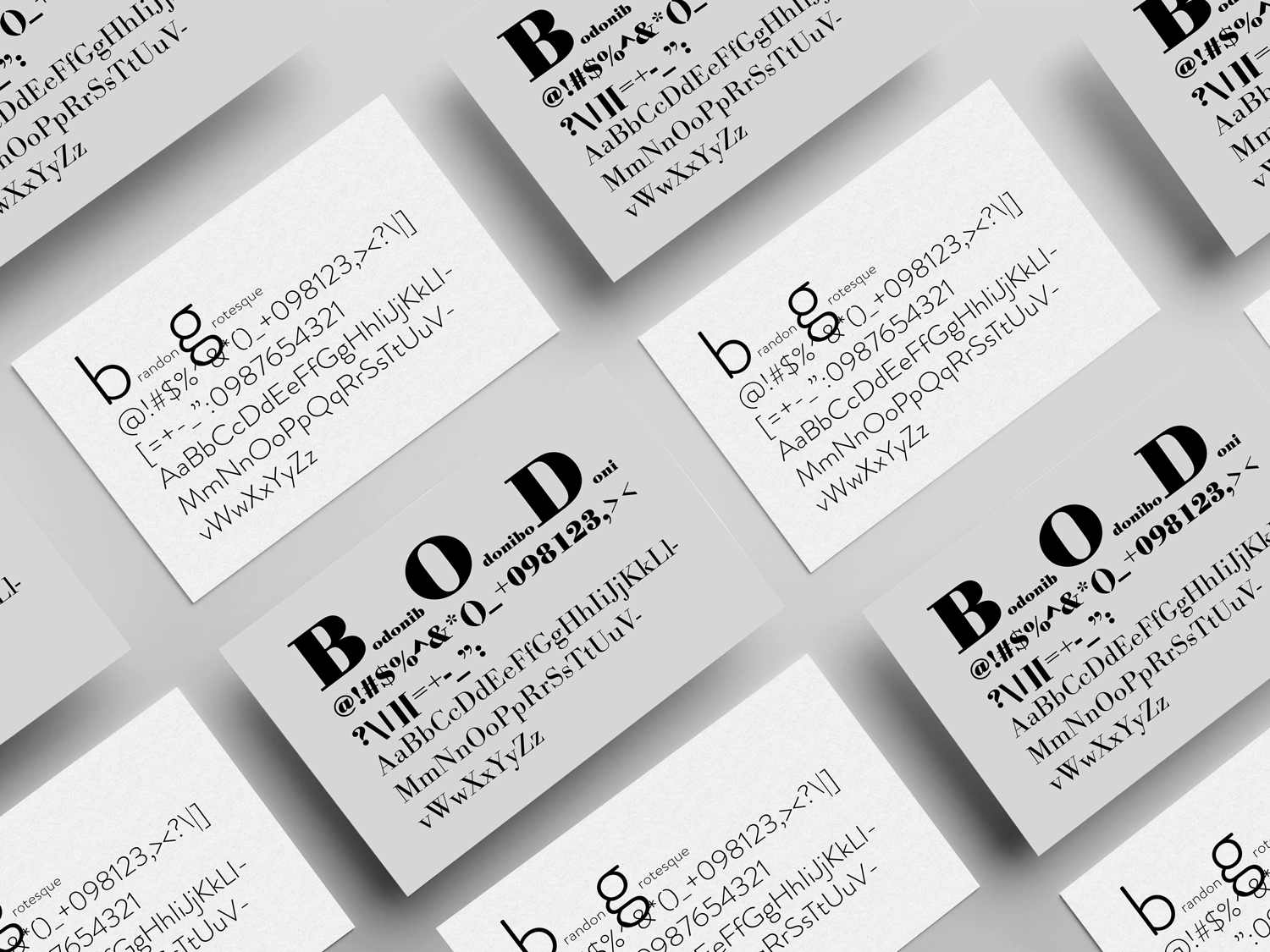
TYPOGRAPHY: I decided to work with Bodoni and Futura for this project. They are a great typographic combination, they contrast each other well and are widely used in editorial design.
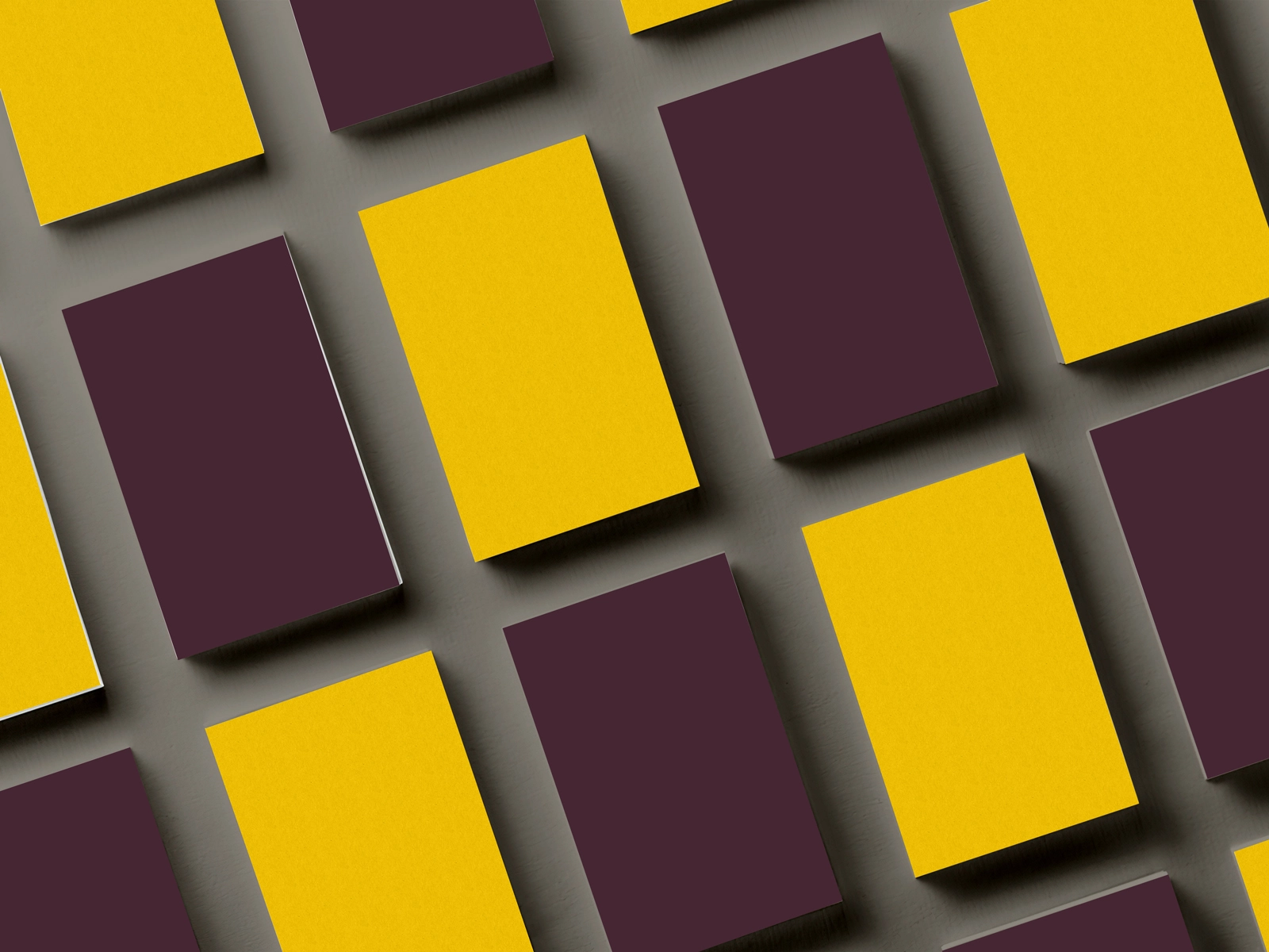
COLOUR PALETTE: I picked four colours to be the brand colours of the magazine. Purple is the colour of creativity, as the tattoo industry is a creative one, it fits perfectly; black is a crucial part of the tattoo art. Apart from this, it signifies prestige and timelessness, which is something I wanted my magazine to symbolise as well; grey is the colour of balance and longevity, it symbolises calmness. Furthermore, black and grey is a tattoo style so I was almost "forced" to incorporate grey in my colour palette. Yellow commands attention and positivity, it is also a creative colour and goes really well with purple, grey and black. Purple and black are the primary, yellow is a secondary colour (also for highlights); the greys are used as tertiary colours and as a background container.
the visual language
Masthead
When redesigning the logo/masthead of the magazine, my focus was to make it consistent across all issues as this was not the case with the old design - the tagline for example, would sometimes be placed above the logo, other times below or somewhere else around it. I also created a consistent cover style to feature the other elements like coverline, price, barcode, date/issue on the same place across the issues.
Typography
I usually work with two different typefaces when I'm developing a brand and while choosing highly- contrasting typefaces. For this project, however, I chose to work with three typefaces, two of which looked similar. Typefaces are usually a challenge when you work with copy in Cyrillic, but I managed to find a good solution to achieve good level of readability and legibility, while also feature typefaces with personality. For the body copy I chose Gill Sans Nova as it's easy to read and has a lot of font weights, for the display messages I chose Lithium Regular and Frankinity (which only comes in uppercase).
Colour palette
The colour palette of the old magazine featured mainly black and white and wasn't very easy to distinguish. I adjusted the black/white theme and complemented it with some additional colours to bring in more personality to the brand, and make it more consistent and recognisable.
The primary colours are a shade of black and an accent orange. The secondary ones feature green, purple, brown/beige and grey. The tertiary colours are tints of the secodnary which are used mainly as background colours on different elements.
The secondary colours are assigned to different sections of the editorial content to bring in more consistency and strengthen the new look.
For primary and secondary print colours have their web counterparts to accommodate for accessibility and enough contrast.
About me
I am a designer based in Bulgaria.I love typography, squares, negative space, and almost anything black and white. When I'm not designing, I read, write, drive, watch documentaries, listen to podcasts, and talk to people about random and not so random stuff.
EMAIL | LINKEDIN | INSTAGRAM | TWITTER
© 2026 | dessutom