a-specto: a new look
Reimagining an independent Bulgarian magazine across print and digital.
AT A GLANCE
Independent concept · Editorial & UX/UI design · Print and responsive web
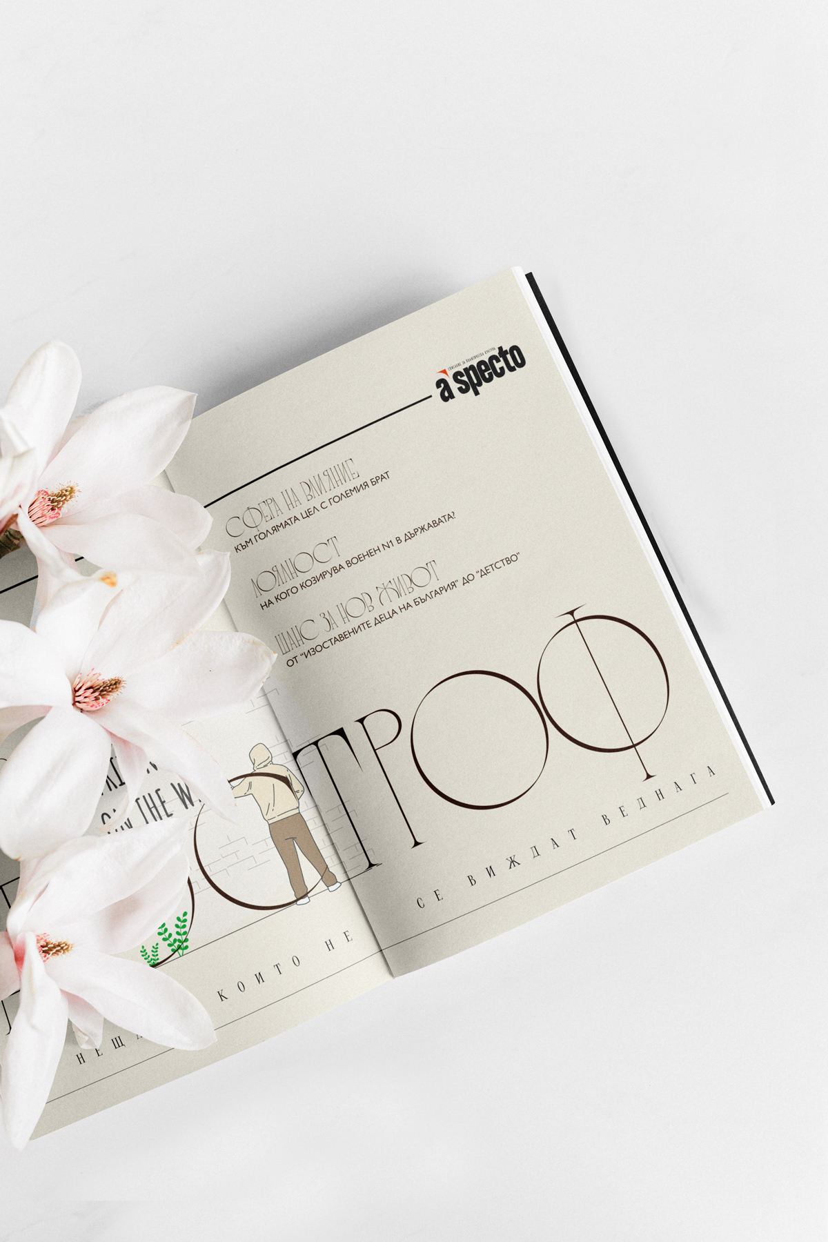
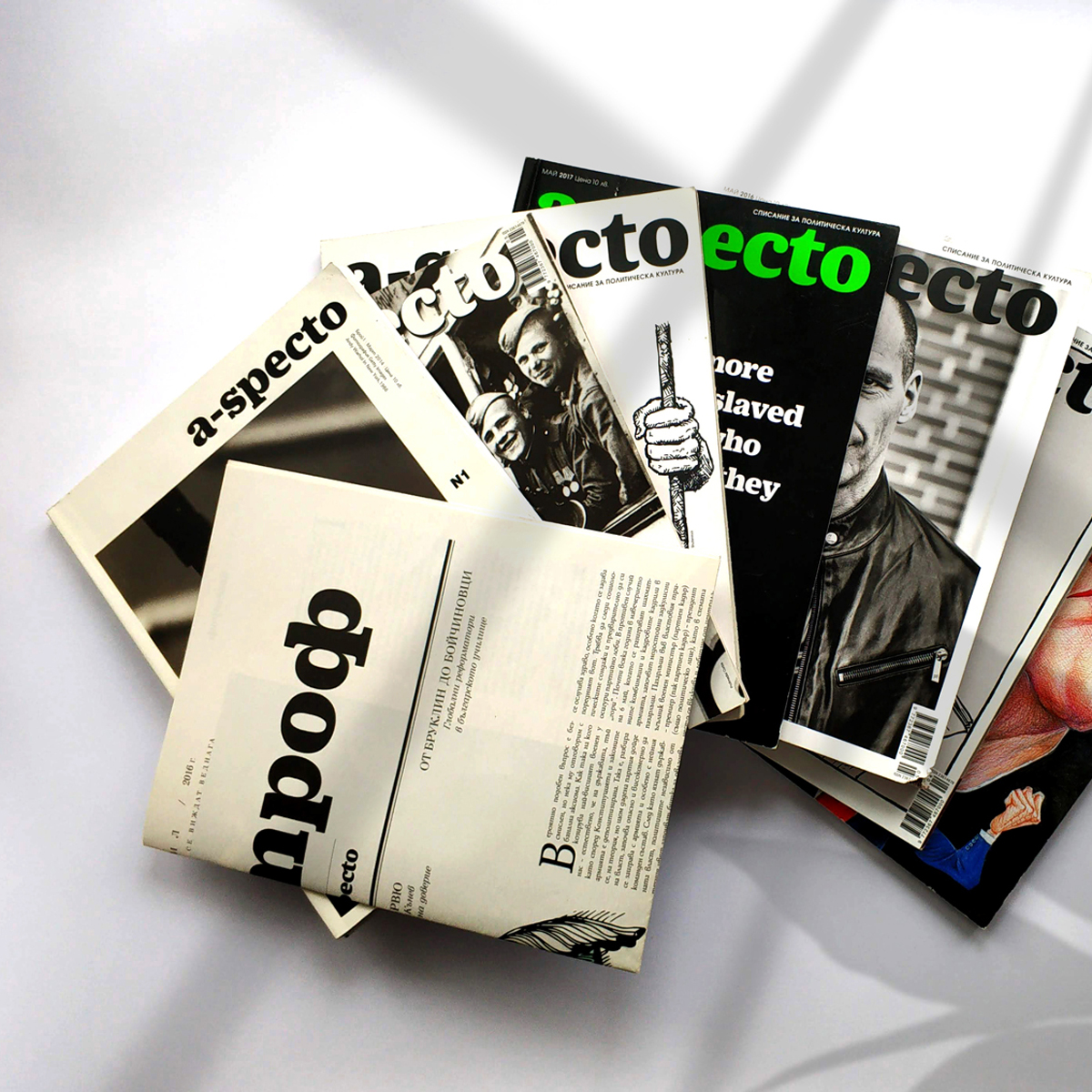
a-specto was an independent Bulgarian magazine known for its thoughtful reporting and commentary. Although its print edition had ceased publication, its archive remained available online.
I used the magazine as the basis for a speculative redesign, exploring how a more coherent visual identity could bring its print and digital experiences closer together.
Project note: This is an independent, speculative redesign. It was not commissioned by or affiliated with a-specto. Editorial material and third-party imagery remain the property of their respective owners.
DESIGN DIRECTION
The original magazine had a distinctive editorial character, but its visual elements were not always applied consistently. My aim was to retain that character while creating a clearer and more recognisable system.
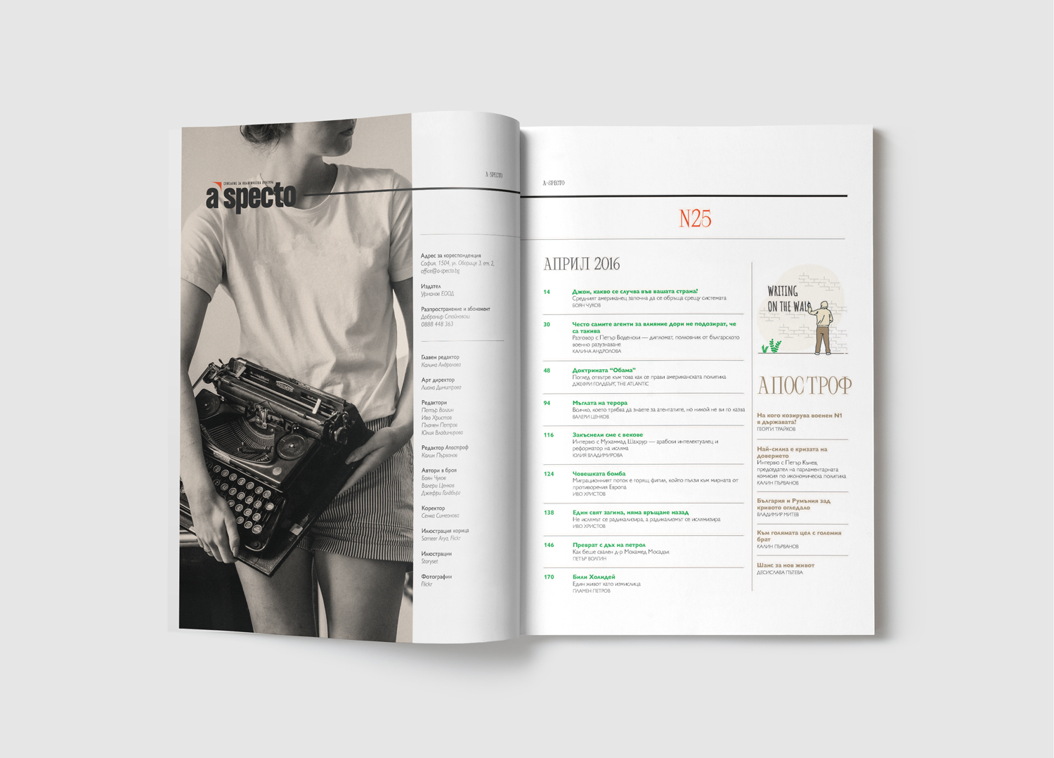
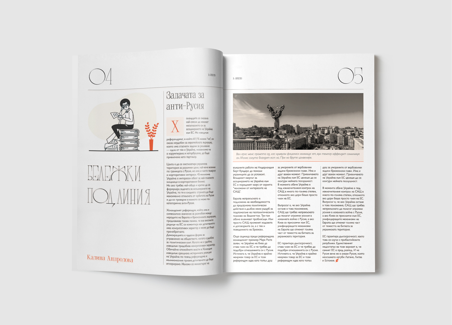
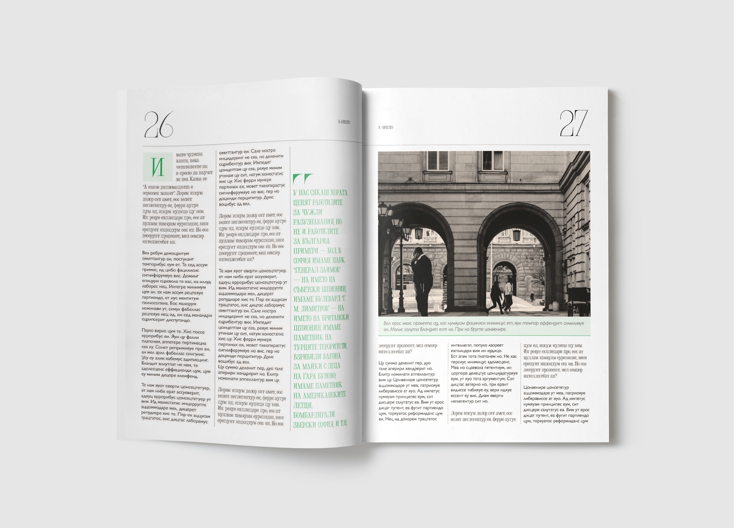
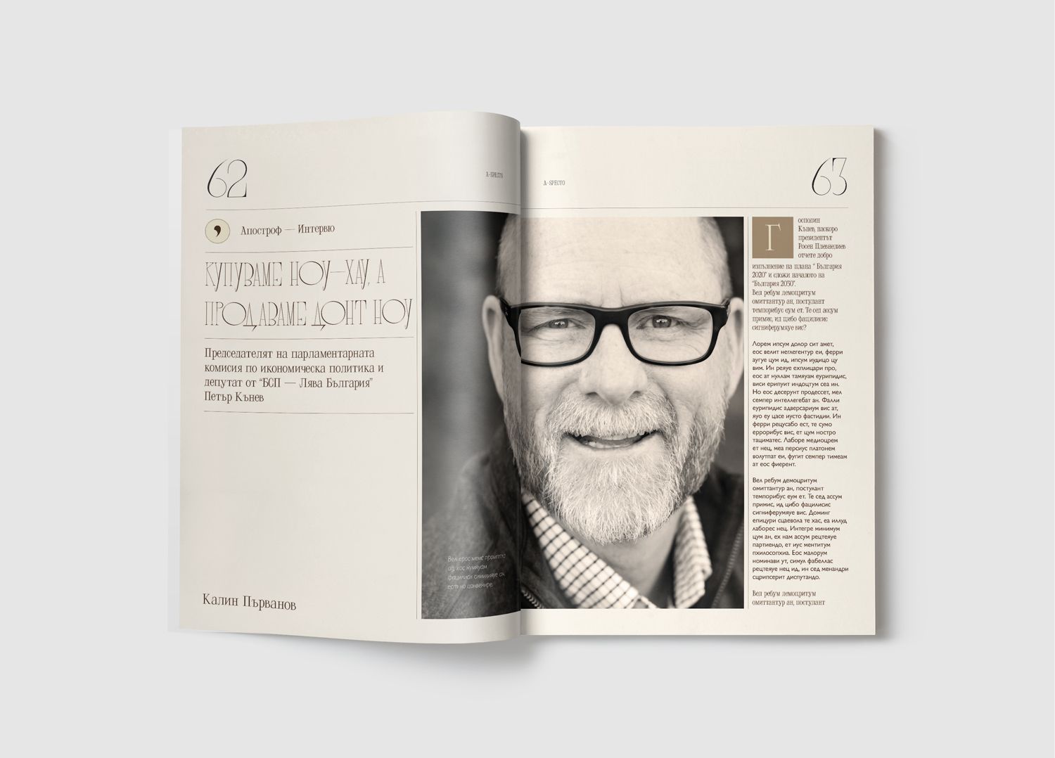
A VISUAL LANGUAGE FOR PRINT & DIGITAL
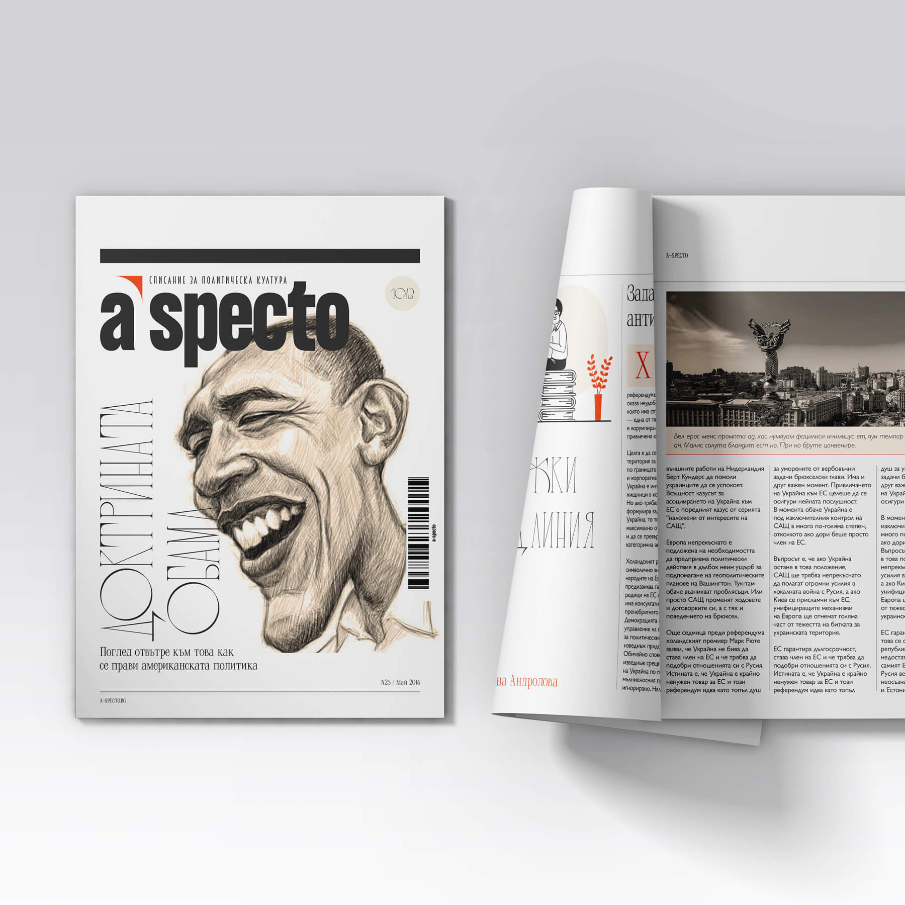
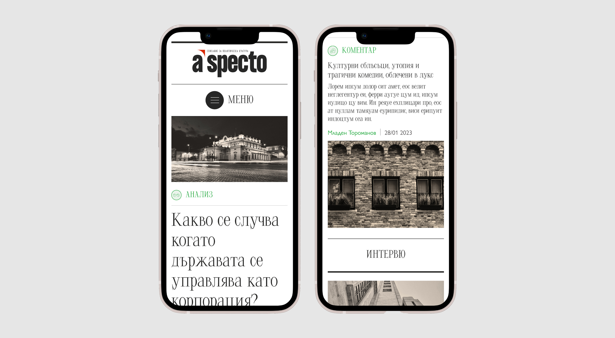
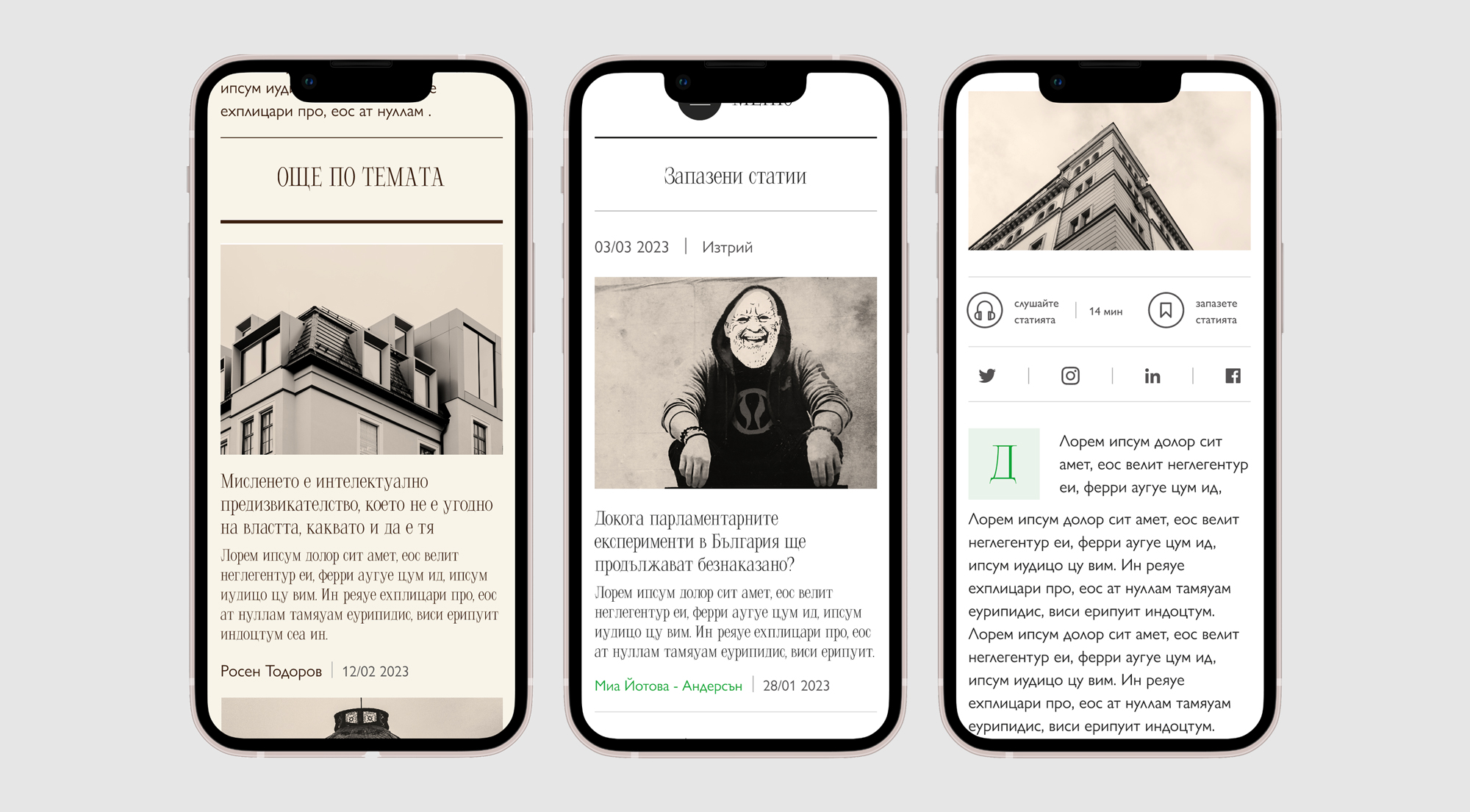
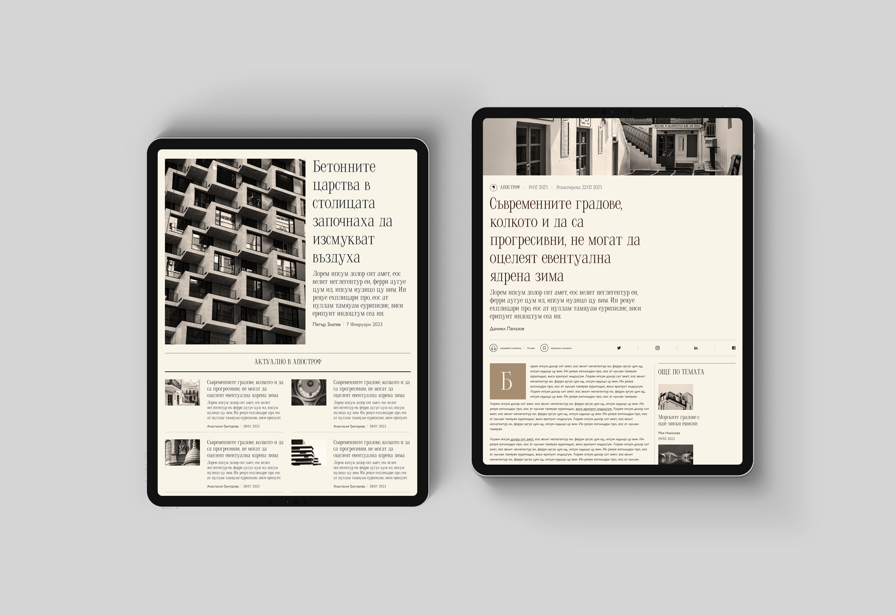
I developed a more consistent masthead, a typographic system that balances character with readability, and a restrained palette built around black, white and a small set of accent colours.
The same principles informed the website concept, where clearer hierarchy and navigation support different ways of exploring the magazine’s archive.
REFLECTIONS
This project gave me an opportunity to think about a publication as one connected experience rather than separate print and digital products. It also reinforced how much an editorial identity depends on consistent decisions about typography, hierarchy and rhythm.

About me
I am a designer based in Bulgaria.I love typography, squares, negative space, and almost anything black and white. When I'm not designing, I read, write, drive, watch documentaries, listen to podcasts, and talk to people about random and not so random stuff.
EMAIL | LINKEDIN | INSTAGRAM | TWITTER
© 2026 | dessutom