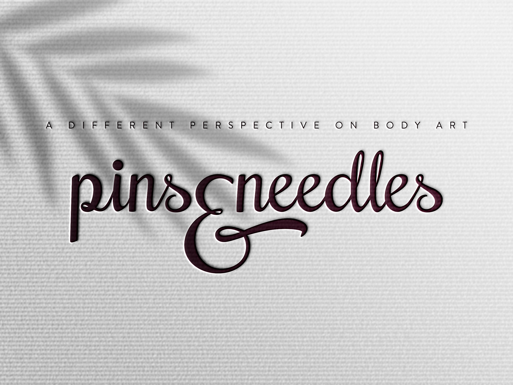
pins & needles
An editorial design exploration of tattoo culture
AT A GLANCE
Project type: Master’s coursework
Role: Editorial & graphic design
Scope: Magazine concept, editorial research, interviews, visual identity and print layout
THE OPPORTUNITY
For a university course in editorial design, I chose to create a magazine about tattoo culture - a subject I’m personally interested in.
Many of the tattoo magazines I came across during my research felt visually cluttered or relied on a narrow representation of the culture. I wanted to explore a different approach: a publication that gave more space to tattoo artists, their work and the stories behind it.
APPROACH
I developed the magazine’s editorial direction alongside its visual identity.
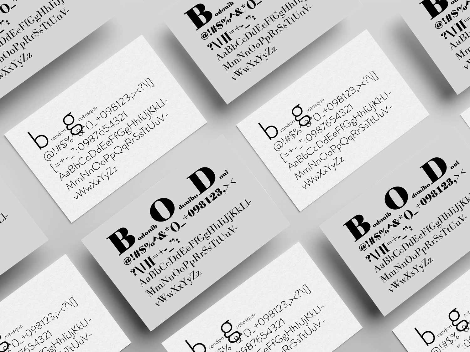
THE VISUAL LANGUAGE
The design balances a restrained overall layout with expressive typography and imagery.
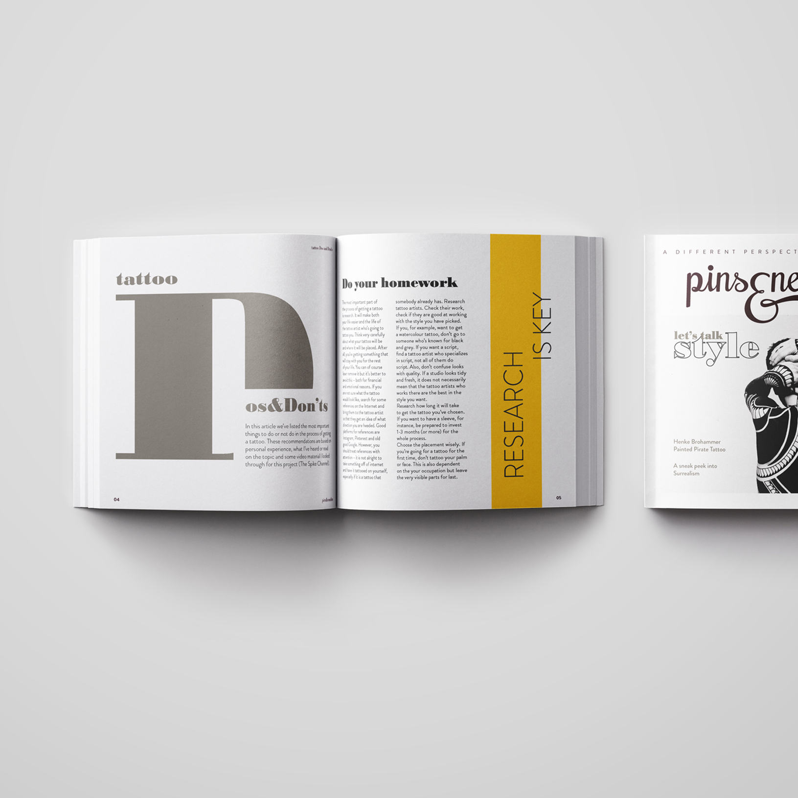
THE MAGAZINE
The finished concept brings together artist interviews, photography and articles exploring different aspects of tattoo culture. I used shifts in typographic scale, image treatment and layout to give each story its own character while maintaining a consistent identity across the publication.
REFLECTIONS
This project gave me the freedom to build an editorial identity around a subject I care about. It also reinforced how much the character of a magazine comes from the relationship between its subject matter, editorial choices and visual design.
Project note: Some images in the magazine belong to the featured tattoo artists and are shown here to present the student project. The artwork remains the property of its respective creators.

About me
I am a designer based in Bulgaria.I love typography, squares, negative space, and almost anything black and white. When I'm not designing, I read, write, drive, watch documentaries, listen to podcasts, and talk to people about random and not so random stuff.
EMAIL | LINKEDIN | INSTAGRAM | TWITTER
© 2026 | dessutom