Rethinking Digimags

Redesigning digital magazines for specialist professional readers
opportunity

AT A GLANCE

Organisation:  New Statesman Media Group  GlobalData
Role: Editorial & UX/UI design
Scope: Digital magazine redesign, reader journeys, responsive layouts, visual language and usability testing
Project status: Redesign explored and tested; implementation paused following changes in business direction

THE OPPORTUNITY

Digimags were digital magazines published across 27 Verdict titles, covering industries including automotive, healthcare, energy and technology. They combined specialist editorial features with commercial material for a professional audience.

The existing experience was hosted on a third-party platform and was difficult to navigate, particularly when moving between sections or returning to previously viewed material. The redesign was an opportunity to make the magazines easier to use while retaining the editorial feel of a publication and supporting the commercial needs of    the business.

CHALLENGES

  • A professional audience: Readers needed reliable, relevant information they could access efficiently, rather than an experience that demanded extensive browsing
  • Editorial and commercial balance: The magazines needed to showcase specialist journalism and client material without making the two difficult to distinguish
  • Navigation and retention: The existing experience made it difficult to move through an issue, return to the contents or continue reading
  • A shared system: The design needed to work across multiple publications while allowing each title to retain its own identity.

APPROACH

  • Reviewed audience research and comparable editorial products to understand common reading and navigation patterns
  • Considered different entry points, including email subscriptions, search results and the main publication websites
  • Explored how navigation and layout could make the magazine structure clearer without losing its editorial character.
  • Developed responsive concepts and refined them through stakeholder feedback and usability testing

THE REDESIGNED EXPERIENCE

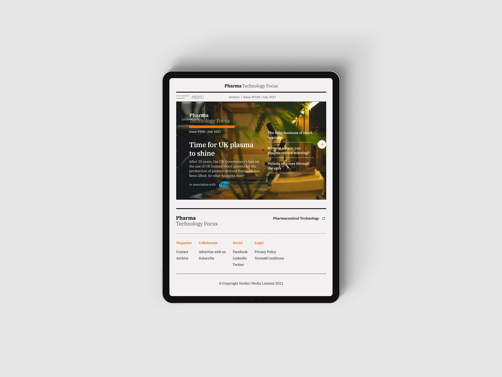
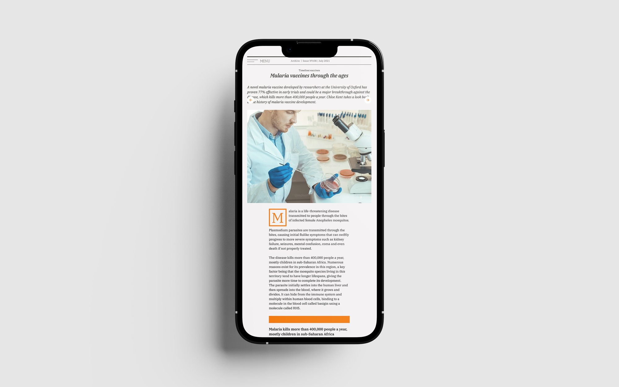
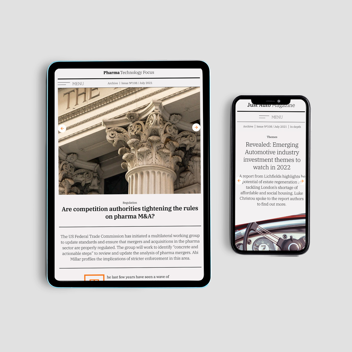
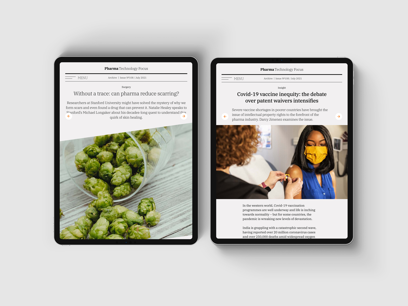
The redesign brought the magazines into a clearer, more consistent structure while leaving room for the different editorial identities of the Verdict titles.
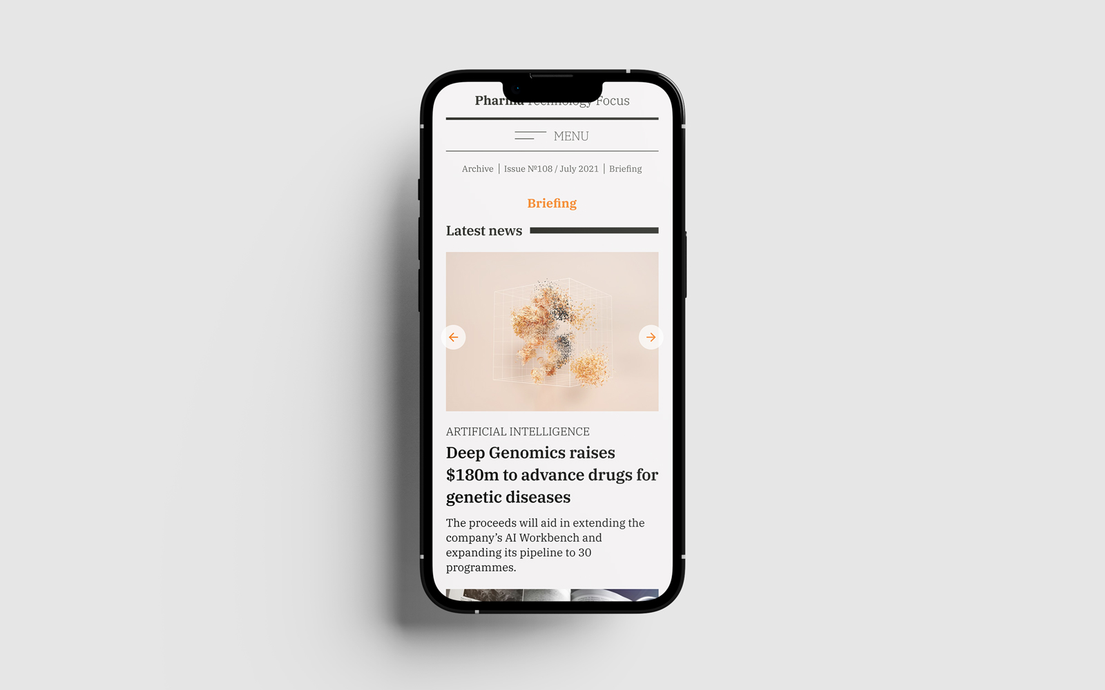
  • Clearer navigation: A more visible route into the magazine, its sections and previous issues.
    Flexible reading: Layouts designed to work across desktop, tablet and mobile
  • Editorial hierarchy: A stronger distinction between the issue’s main feature, supporting articles and commercial material
  • A shared visual foundation: Consistent structural elements paired with publication-specific typography and imagery
articles
mobile-briefing
iPad-Pro-Mockup-2
article-mobile

TESTING & LEARNING

We tested an interactive prototype with six participants to understand how people navigated the magazine and moved between its sections.

The test highlighted several points of confusion:

  • Participants often overlooked the magazine’s main navigation and looked for it in the top-right corner instead
  • The website search and magazine search were not clearly distinguished.
    Readers did not always recognise the magazine’s section structure or understand how to move between sections
  • Participants tended to rely on familiar website navigation patterns rather than the magazine’s left and right browsing controls
  • The findings informed changes to the design, particularly around navigation and the distinction between the magazine and the wider publication website

OUTCOMES

  • Developed a responsive redesign direction for the Digimags experience across Verdict publications
  • Tested an interactive prototype and used the findings to refine the navigation and magazine structure
  • Created a further exploratory prototype investigating how editorial, advertising and motion could work together in a digital-magazine format
    The original redesign was not implemented as planned following changes in business direction

REFLECTIONS

  • Familiarity matters. The usability test showed that readers brought expectations from conventional websites into the magazine experience. A distinctive editorial format still needs clear, recognisable ways to navigate
  • Editorial design extends beyond the page. This project gave me an opportunity to think about how the rhythm and character of a magazine translate into a digital experience shaped by different entry points, devices and reader needs
circle-1

About me

I am a designer based in Bulgaria.I love typography, squares, negative space, and almost anything black and white. When I'm not designing, I read, write, drive, watch documentaries, listen to podcasts, and talk to people about random and not so random stuff. 

© 2026 | dessutom

View