Brand refresh: FT Adviser

Refreshing a long-standing financial publication to improve accessibility, consistency and editorial clarity, while modernising its visual language
the-opportunity-image

AT A GLANCE

Organisation: Financial Times | FT Adviser
Timeline: 3-month redesign project, 2024
Role: Editorial, graphic & product design
Scope: Accessibility, visual consistency, editorial hierarchy, responsive UI patterns, modernisation of a legacy publication experience

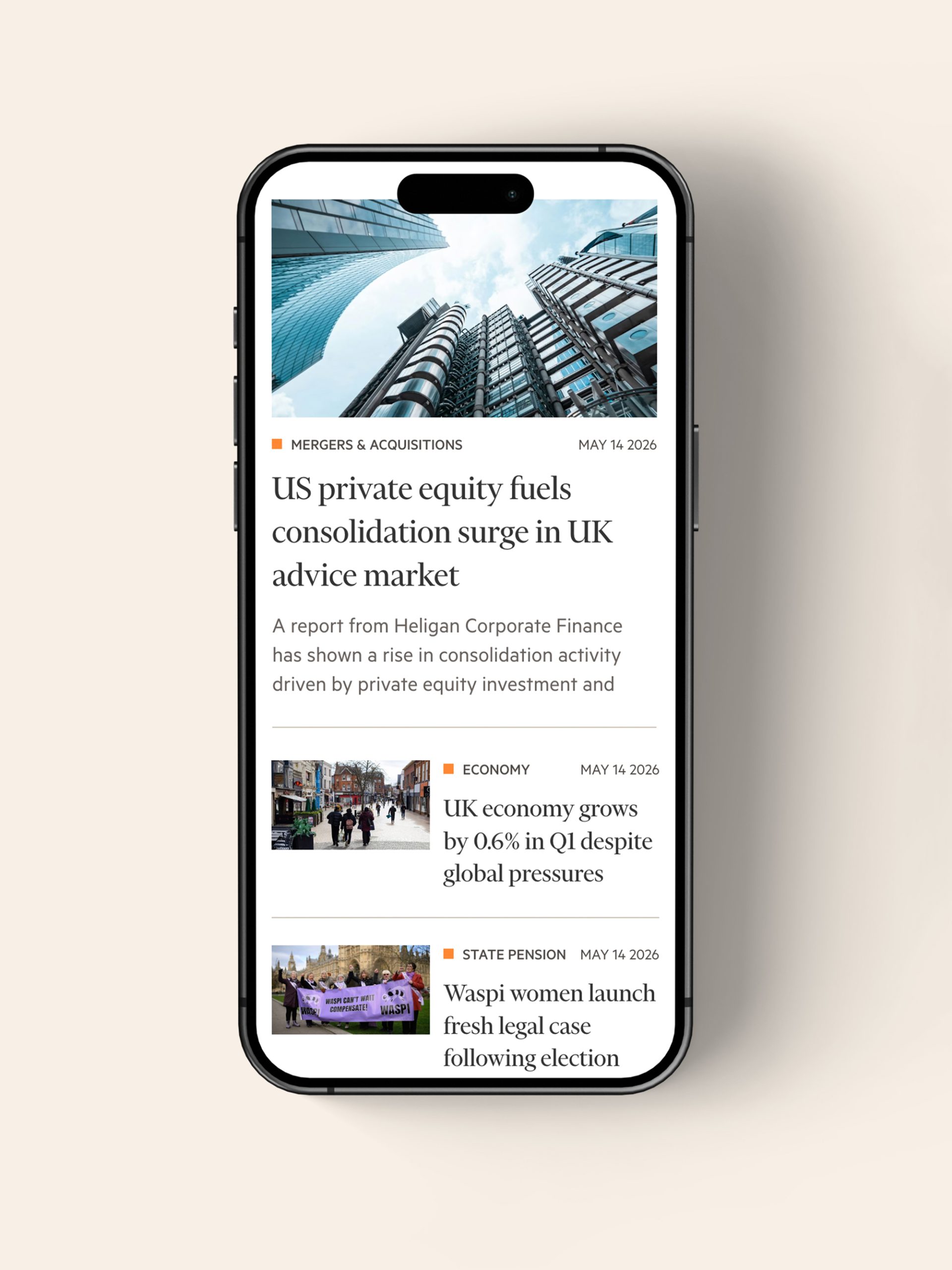
FT Adviser is a long-running financial publication within the Financial Times’ product portfolio, serving financial advisers and industry professionals with news, analysis and market insights. The project focused on modernising the platform’s visual language and improving accessibility, consistency and editorial clarity, while working within the constraints of an established product and a shared design system.

PROBLEM SPACE

  • FT Adviser's visual language and website functionality hadn’t been updated since 2016 (colour-heavy backgrounds, heavy drop shadows, non-standard image ratios)
  • Inconsistent typography and UI patterns, not compliant with EU accessibility laws 
  • Navigation issues & inconsistent responsive layouts, not aligned with the FT's design system
  • Cluttered pages with little white space 
  • The product needed to modernise without alienating a long-term readership

APPROACH

  • Audited typography, colour and layout against accessibility standards
  • Simplified hierarchy to support scanning and comprehension
  • Introduced a more consistent visual system aligned with the wider FT ecosystem
  • Balanced modernisation with familiarity for existing readers

OUTCOMES & IMPACT

  • Stronger alignment with accessibility standards
  • Improved consistency and readability across key templates
  • Clearer hierarchy and navigation
  • Alignment with the FT's company-wide design system 
  • Reduced friction between editorial layout and advertorial content
  • A more coherent and contemporary foundation for future editorial work

CHALLENGES & LESSONS LEARNED

  •  Balancing UX needs with broader brand considerations required careful negotiation across teams with different priorities and levels of product context.
  • Existing technical limitations and uneven design-system adoption meant some solutions had to be adapted during implementation.
  • The project reinforced the importance of more detailed, implementation-focused handovers — particularly dedicated discussions with engineers around technical constraints and architecture before development begins.
  • More broadly, the experience highlighted how much successful editorial design depends on communication, alignment and flexibility across teams.
circle-1

About me

I am a designer based in Bulgaria.I love typography, squares, negative space, and almost anything black and white. When I'm not designing, I read, write, drive, watch documentaries, listen to podcasts, and talk to people about random and not so random stuff. 

© 2026 | dessutom

View